LUXSY
JEWELS.
From a signature to a complete brand experience.
By Fettah — El Florentino
An identity you can wear.
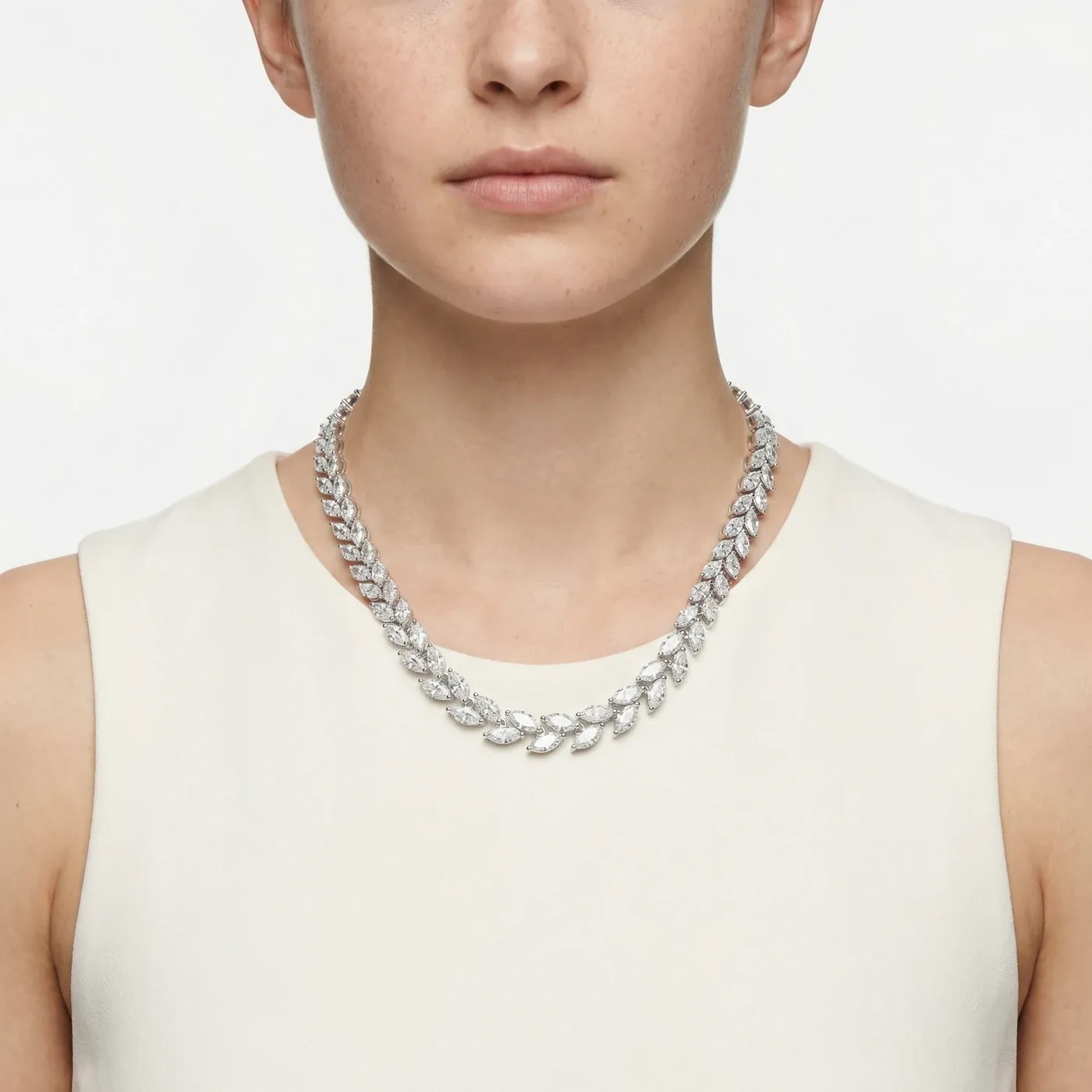
Role & creative decisions
- My responsibility
- Brand identity, image direction, AI-assisted product imagery, retouching and website design.
- Creative focus
- Give the jewellery one recognisable visual language across the identity, product collection and digital experience.
- Key decisions
- A palette informed by material and texture; restrained typography; isolated and worn views that balance product detail with human scale.
- Delivered work
- An identity system, a refined product image collection and a website carrying the same visual direction.
THE SCOPE
One identity. Every point of contact.
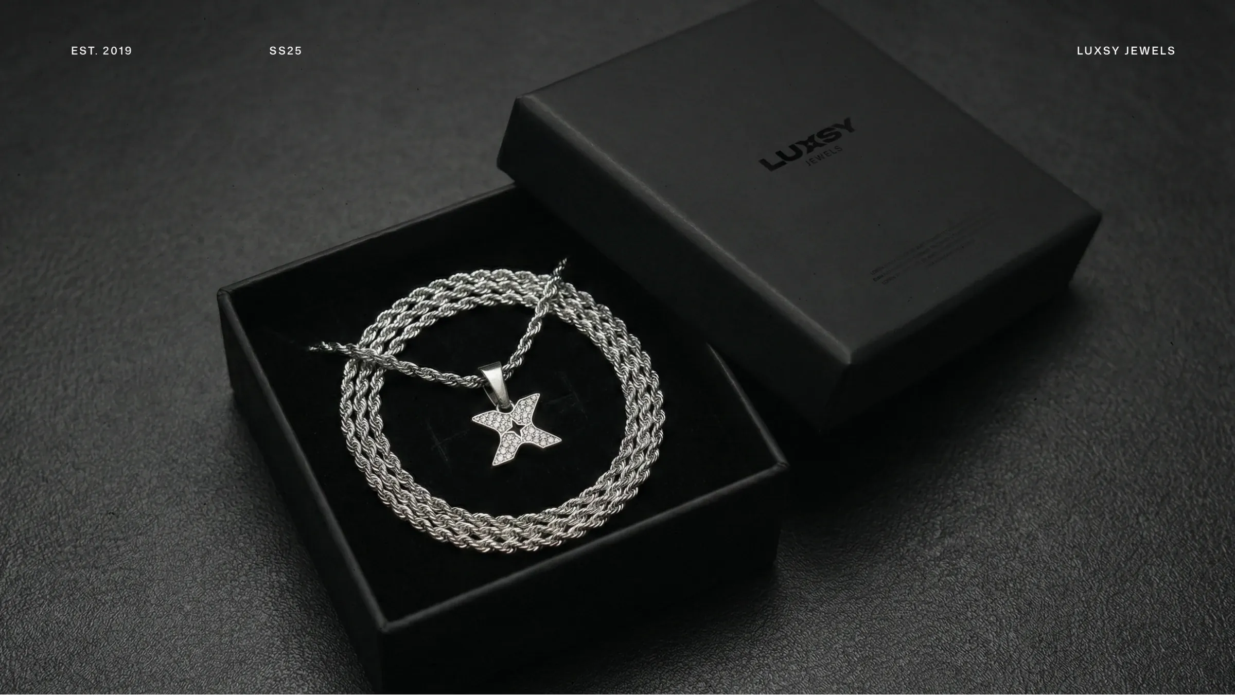
I developed Luxsy’s visual identity and website, alongside an extensive body of AI-assisted product imagery and retouching. The work connects the smallest brand detail with the way the full collection is presented online: a recognisable mark, a consistent image language, and a store that puts the jewellery first.
Brand identity
Concept, mark, typography,
colour, and applications.
Product imagery
AI-assisted image production,
retouching, and on-model views.
Website design
Brand expression, collection browsing,
and product presentation.
01 / THE IDENTITY
A signature, distilled.
The central idea is refinement through reduction. A strong silhouette gives the brand presence; space and restraint allow the jewellery to carry the detail. That balance runs through the identity, the product images, and the digital experience.
BALANCE / TENSION / SYMMETRY
Presence in the form.
Precision in the space.
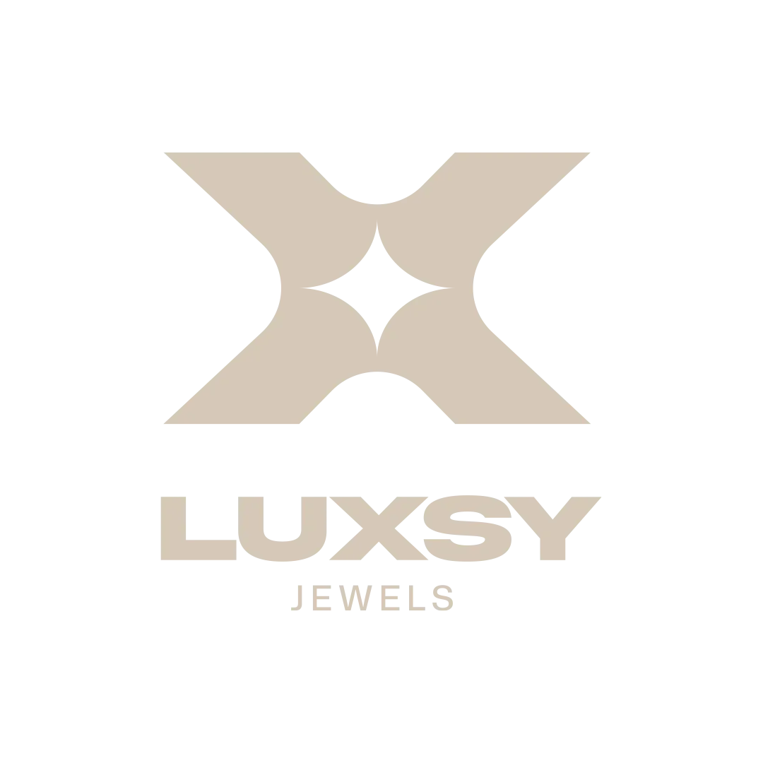
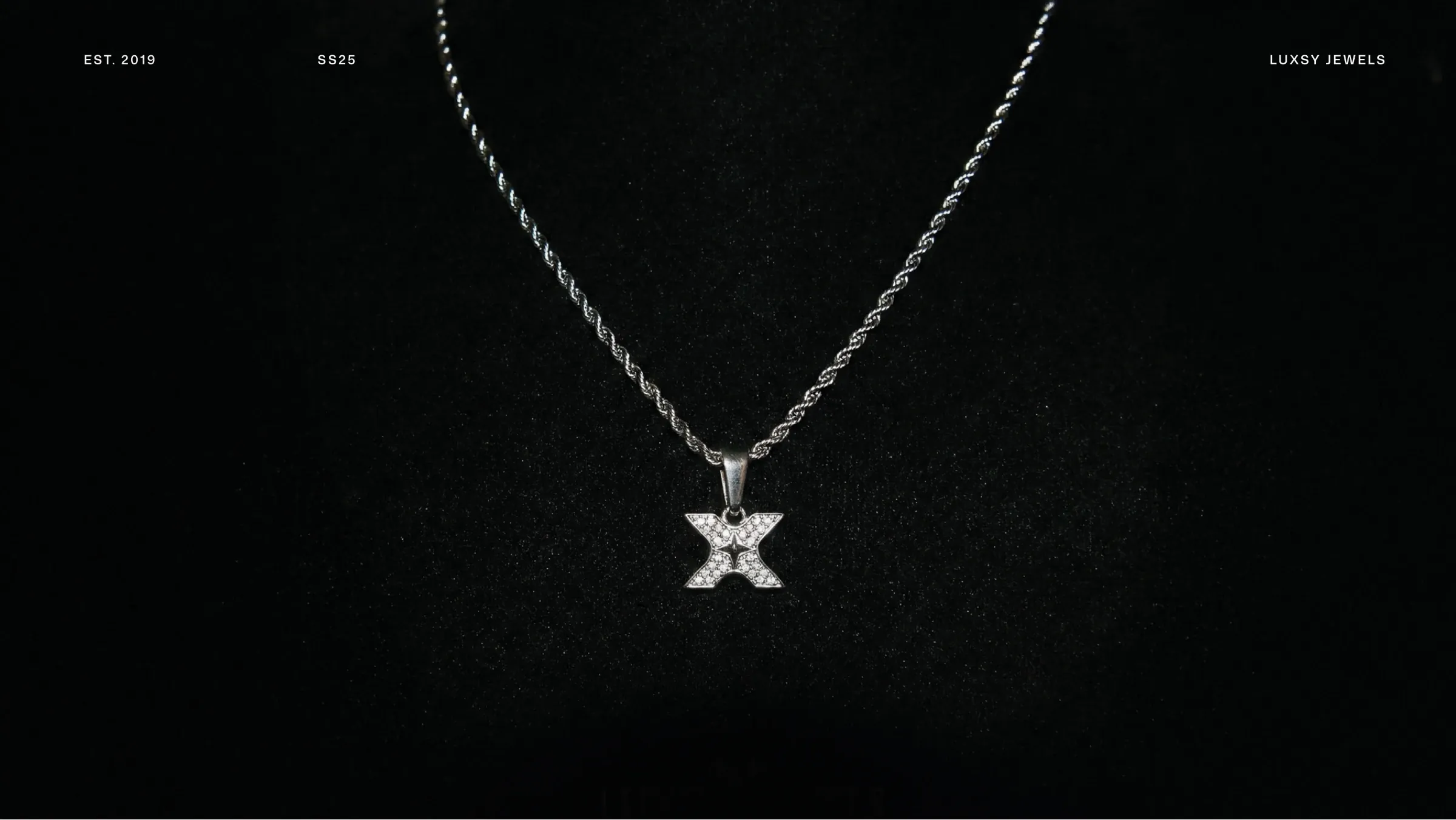
The X holds the identity together. Opposing curves and sharp edges create a symmetrical silhouette, while the spark-shaped space at its centre gives it a distinctive point of focus. A standalone symbol, horizontal wordmark, and vertical lockup make the same signature useful at different scales.
 THE SYMBOLTHE WORDMARK
 THE VERTICAL LOCKUP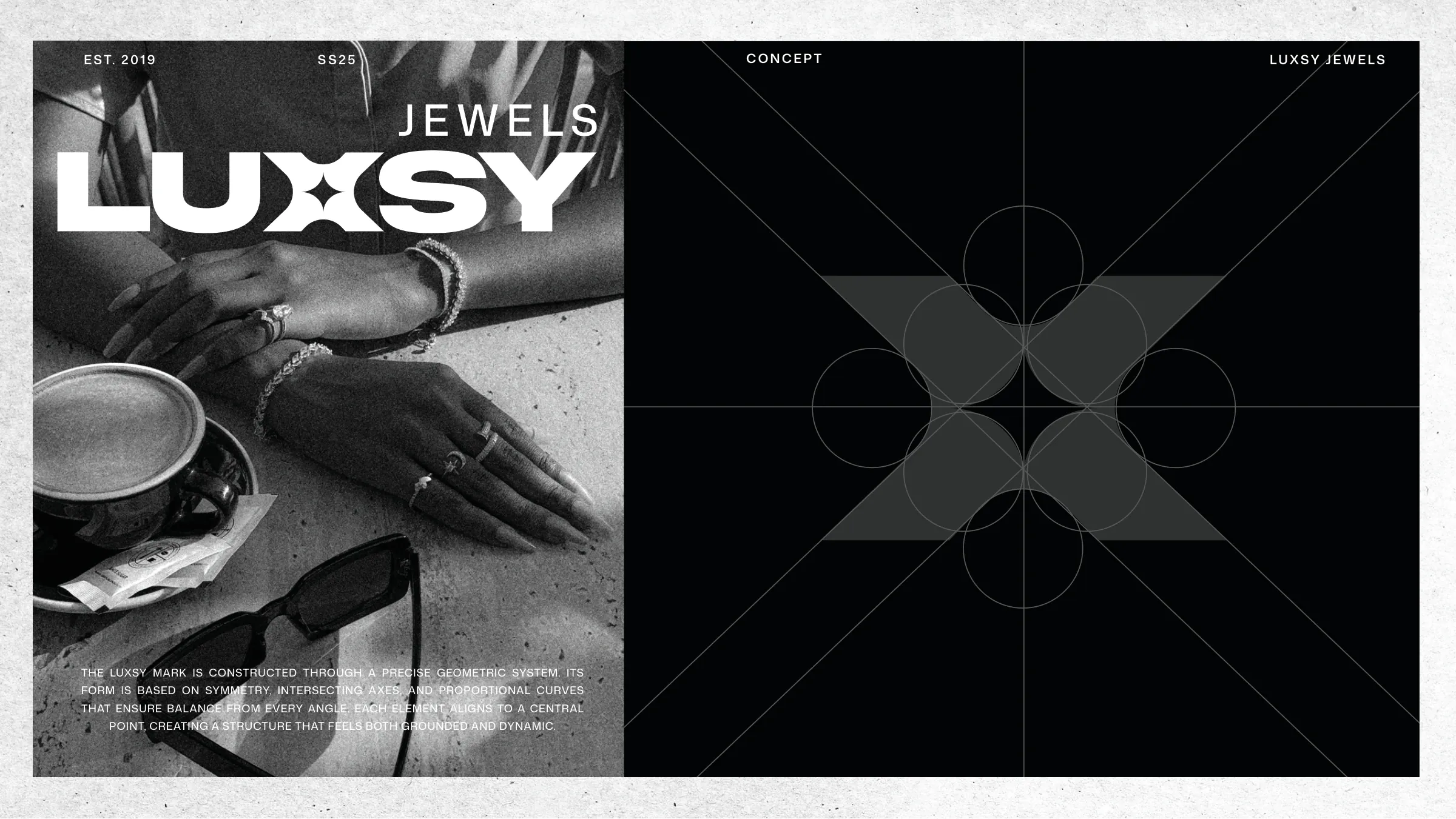
PRIMARY COLOURS / MATERIAL INSPIRATION
Colour as a feeling.
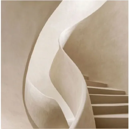
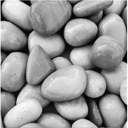
The palette begins with a feeling of material, light, and touch. The references in the brand book move from dark layered stone to chalky off-white surfaces, warm architectural curves, and smooth grey pebbles. Those textures translate into four restrained tones: presence, space, warmth, and structure. Together, they let the jewellery’s form and finish remain the focus.
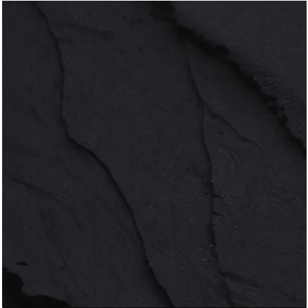
Primary
Luxsy Black
#0B0B0BPresence / depth
Dark layered stone gives black a sense of weight and quiet authority. Used for the mark, typography, and strong contrast.

Off-white
Luxsy Paper
#F4F3EFSpace / softness
A chalky surface catches the light without feeling stark. The off-white gives backgrounds and layouts a softer breathing space.
Editorial neutral
Warm Beige
#D6C9B8Warmth / form
Sculptural architectural curves suggest warmth and tactility. Beige brings soft contrast to lifestyle layouts and background accents.
Utility tone
Soft Grey
#9A9A9ABalance / structure
Smooth pebbles suggest a calm, grounded neutral. Grey supports dividers, diagrams, and secondary information.
TYPOGRAPHY / MONA SANS
A clear voice.
A considered range.
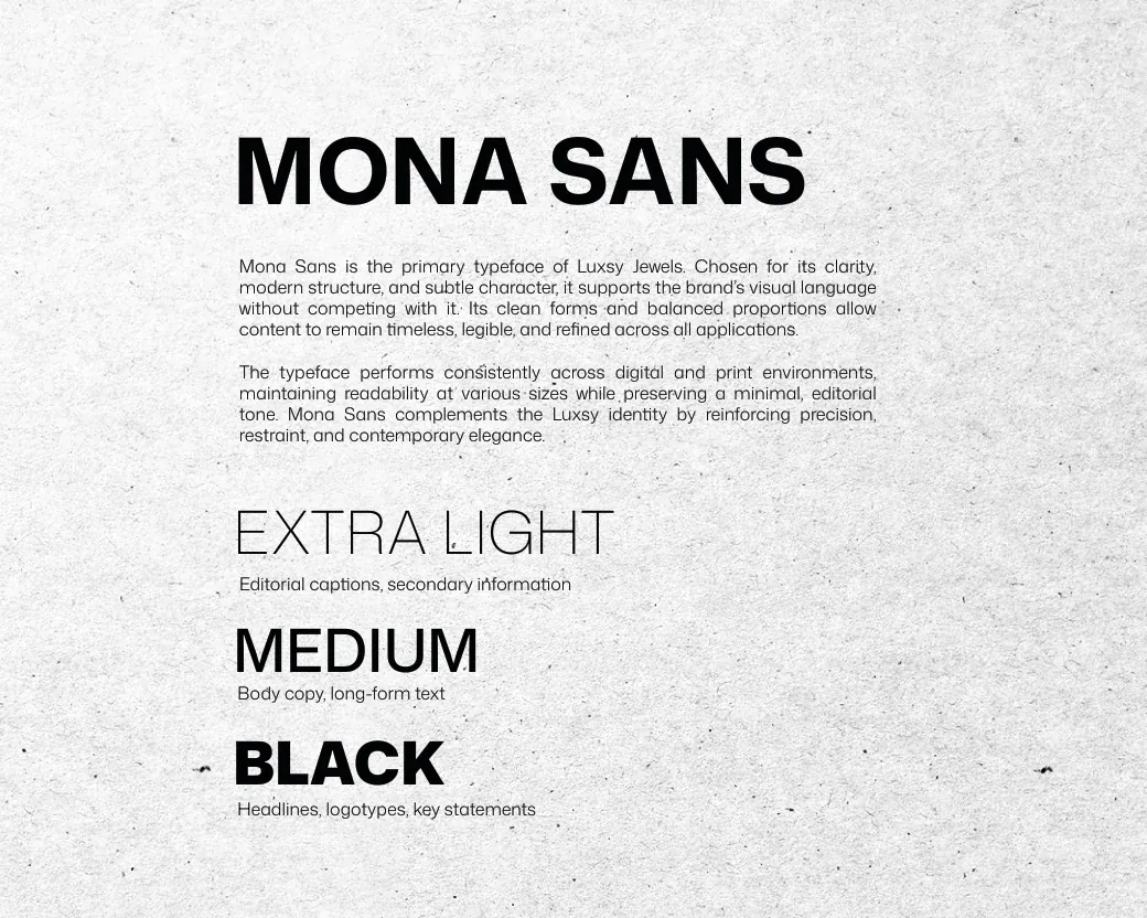
Mona Sans gives the identity a clear typographic foundation. The original system moves from Extra Light for secondary information through Medium for reading to Black for strong statements — a controlled range of weight within one family.
THE VERBAL IDENTITY
Quiet confidence. In words.
The verbal identity follows the same restraint as the visual system. Luxsy speaks with clarity and quiet confidence: composed, direct, and human. Short, deliberate sentences let the jewellery and imagery lead, with an editorial rhythm that feels refined yet approachable.
Luxsy does not seek attention. It earns it.
From the Luxsy brand guidelines
Confident & understated
Calm statements and measured language give the brand assurance without exaggeration.
Clear & deliberate
Simple words and short sentences make each message feel considered.
Editorial & human
An approachable voice keeps the focus on the wearer and the piece, without corporate distance.
The guidelines leave out hype, over-promising, loud calls to action, trendy slang, and overly emotional storytelling.
02 / PHOTOGRAPHY DIRECTION
Presence, naturally.
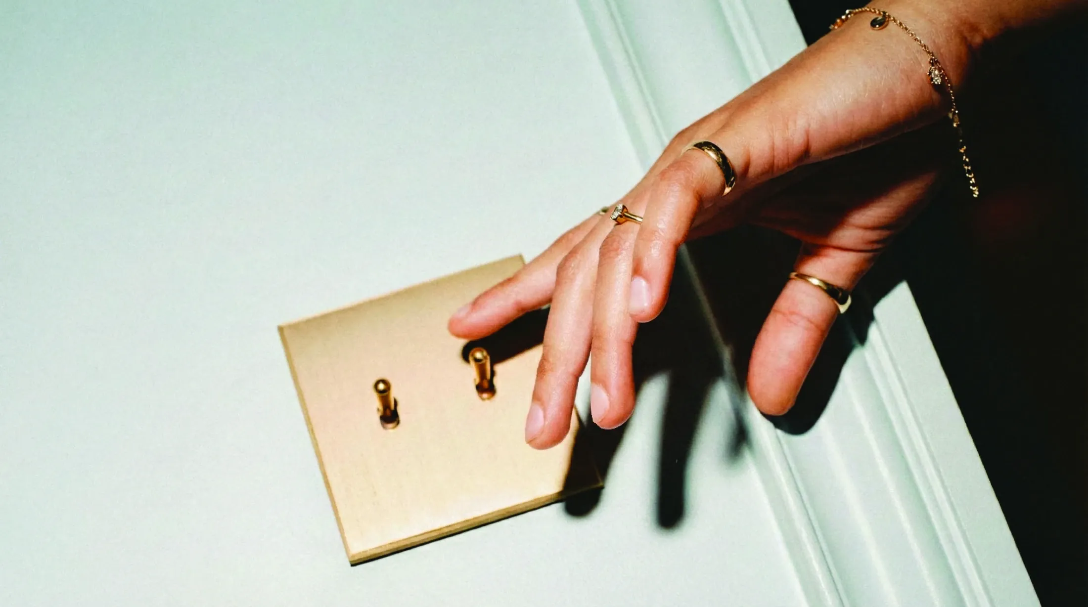
The photography direction starts with moments rather than poses. Jewellery belongs in real environments and everyday rituals, feeling personal, instinctive, and quietly confident. The aim is a sense of presence: images that feel discovered rather than constructed.
Light & atmosphere
Natural or softly directional light creates visible shadows and depth. Window light, sunlight, and architectural illumination shape the scene, with controlled highlights, preserved textures, and measured contrast.
Composition & framing
Cropped perspectives bring hands, wrists, necklines, and small gestures into focus. Imperfect framing and subtle movement give the camera an observational point of view.
Subject & styling
Neutral, tactile styling lets the jewellery feel worn and lived-in. The wearer is relaxed and self-possessed, with the piece integrated naturally into the moment.
03 / IMAGE PRODUCTION & RETOUCHING
The product, in focus.
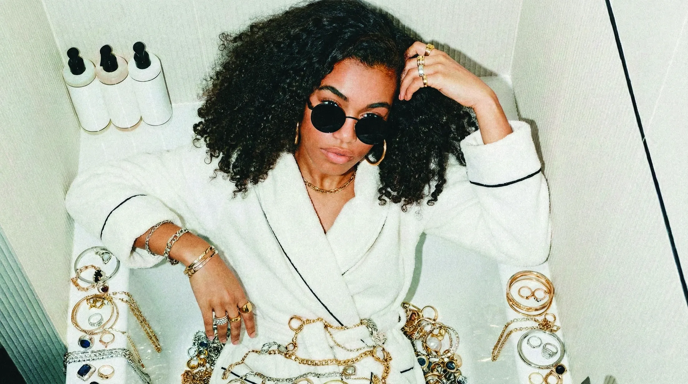
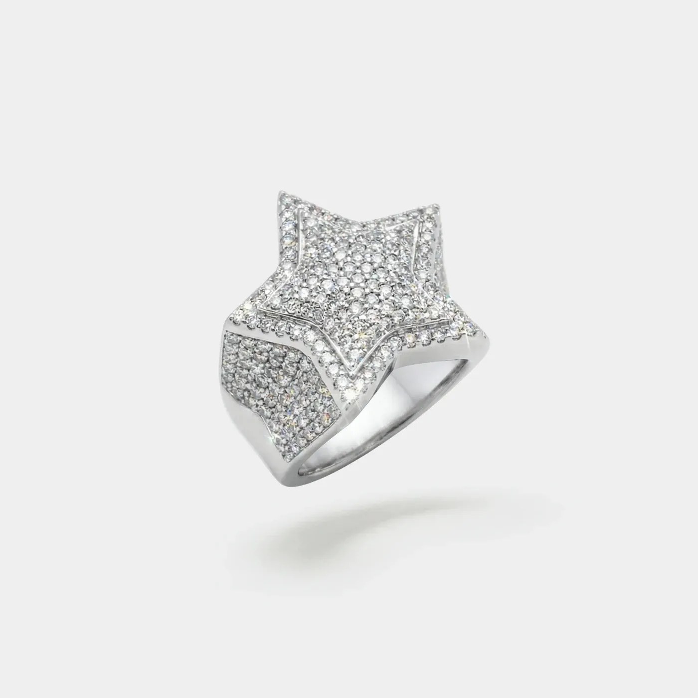
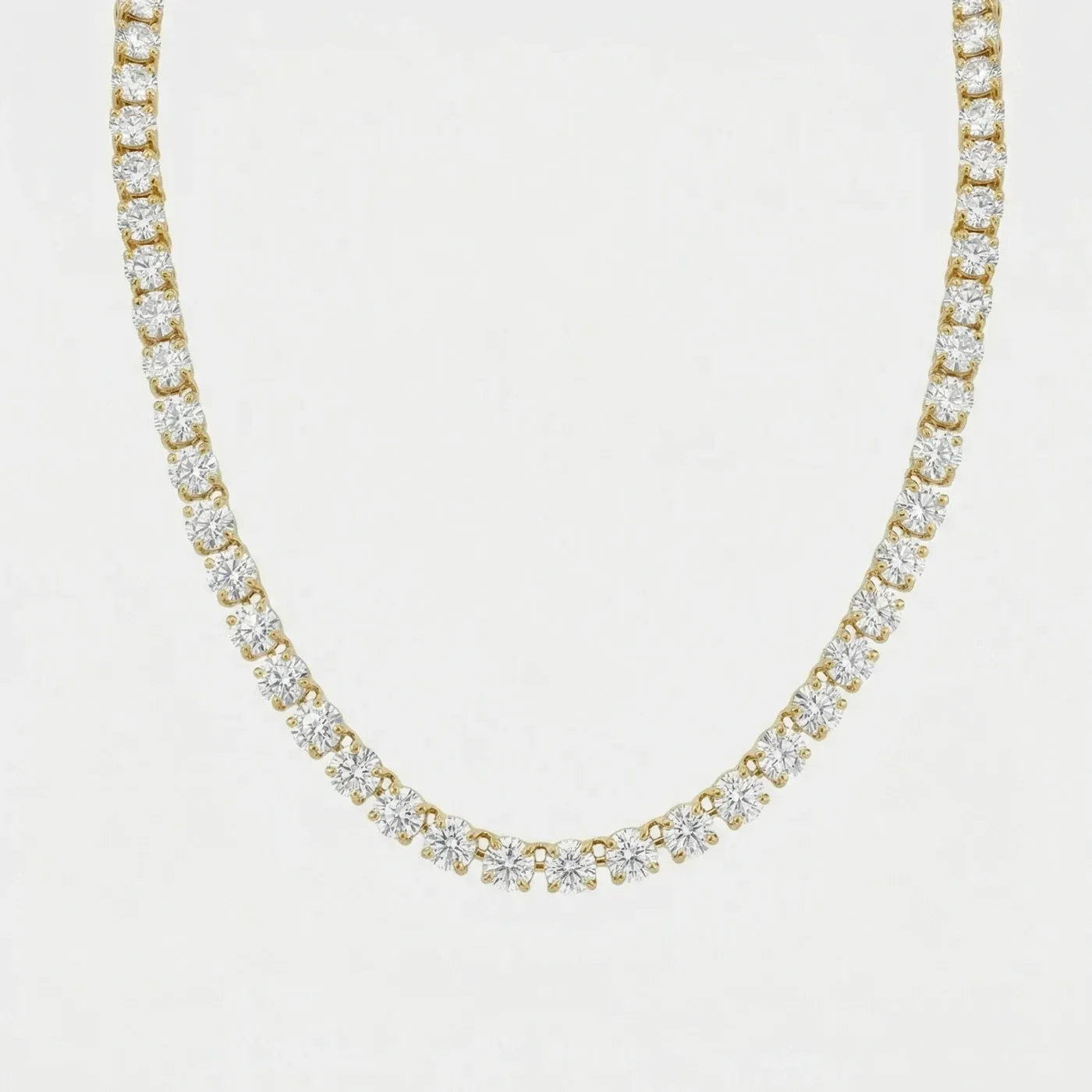
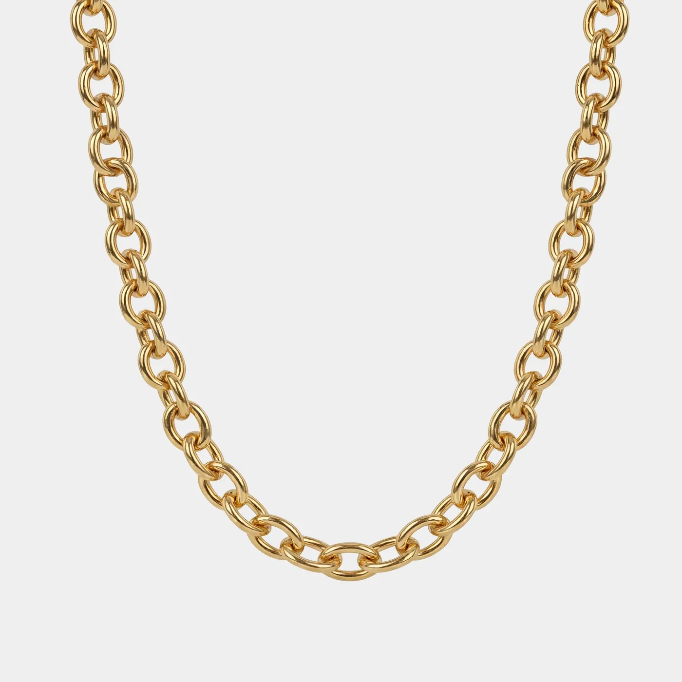
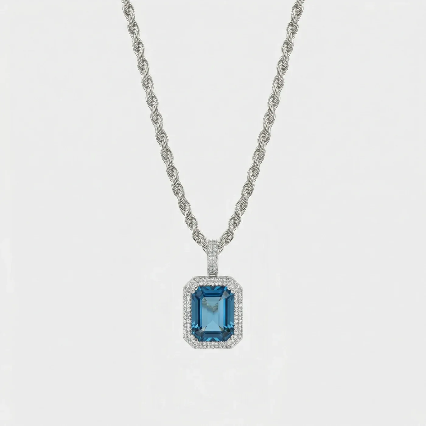
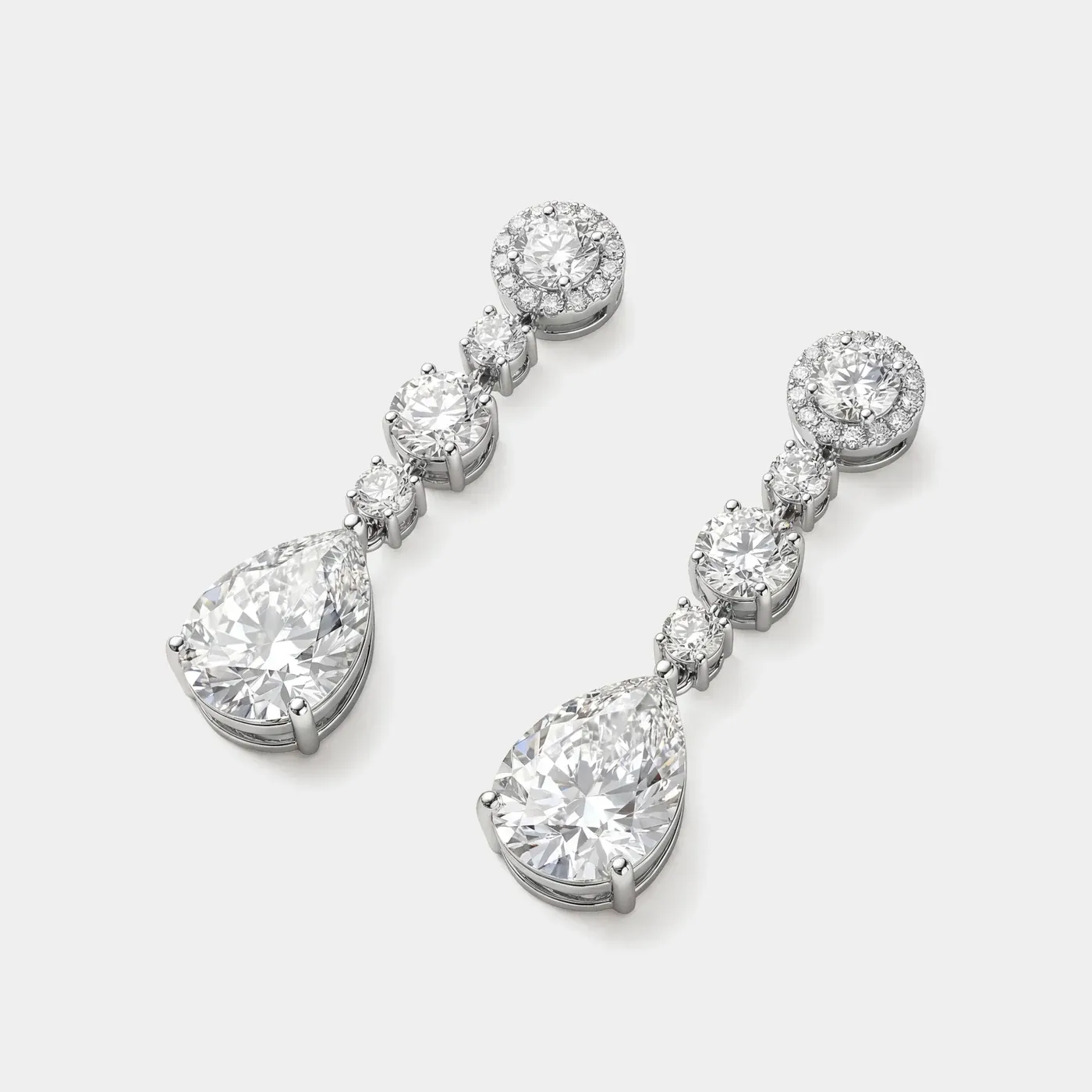
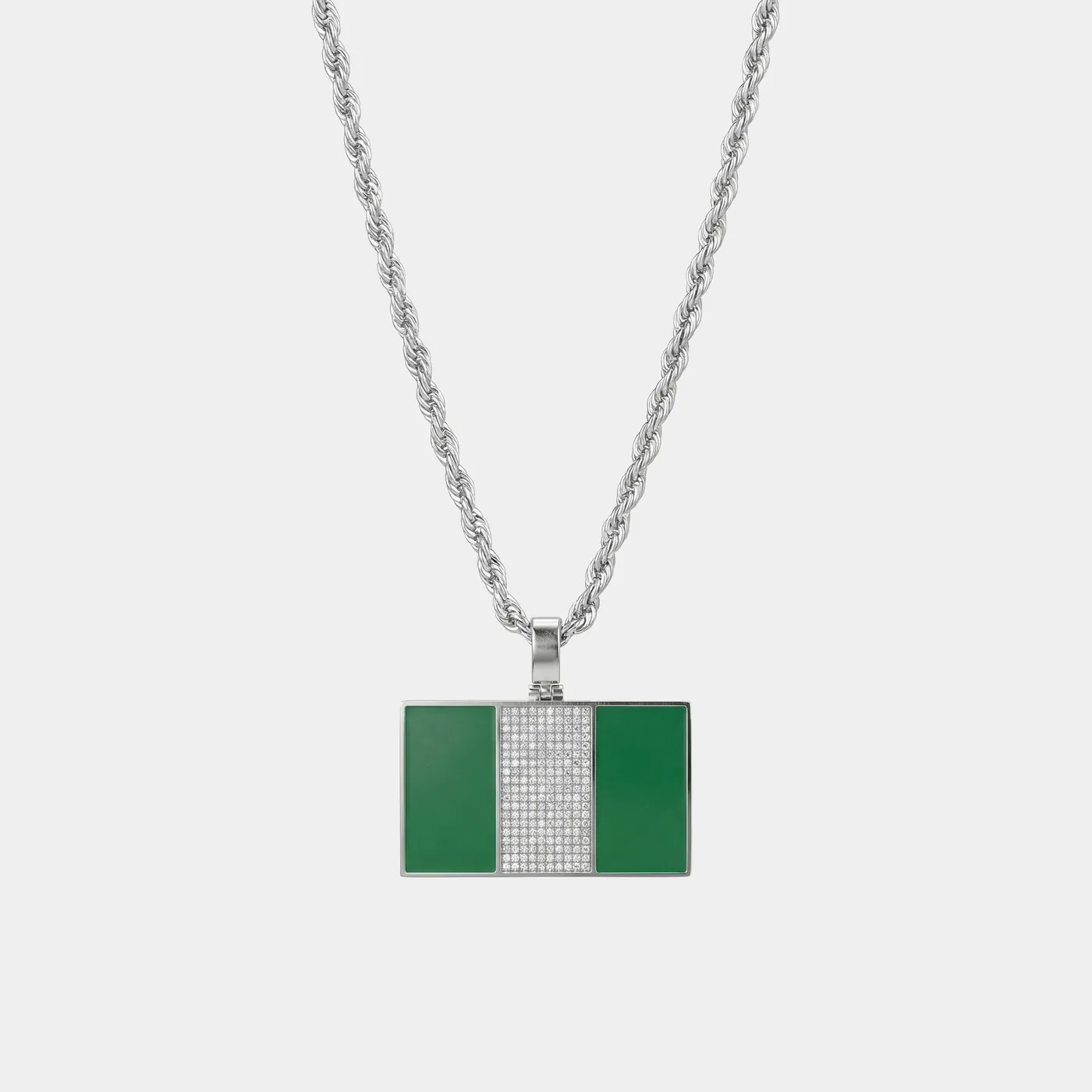
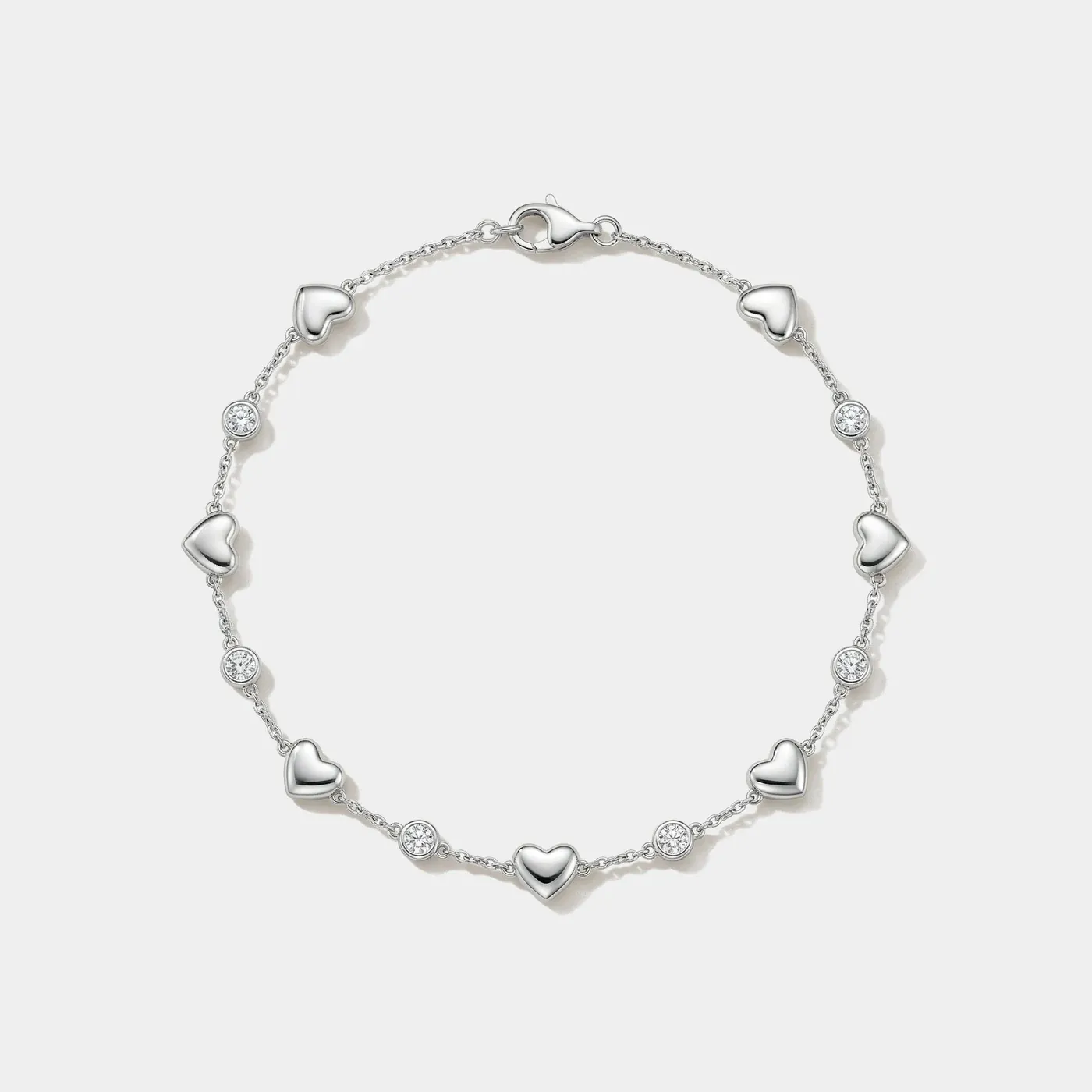
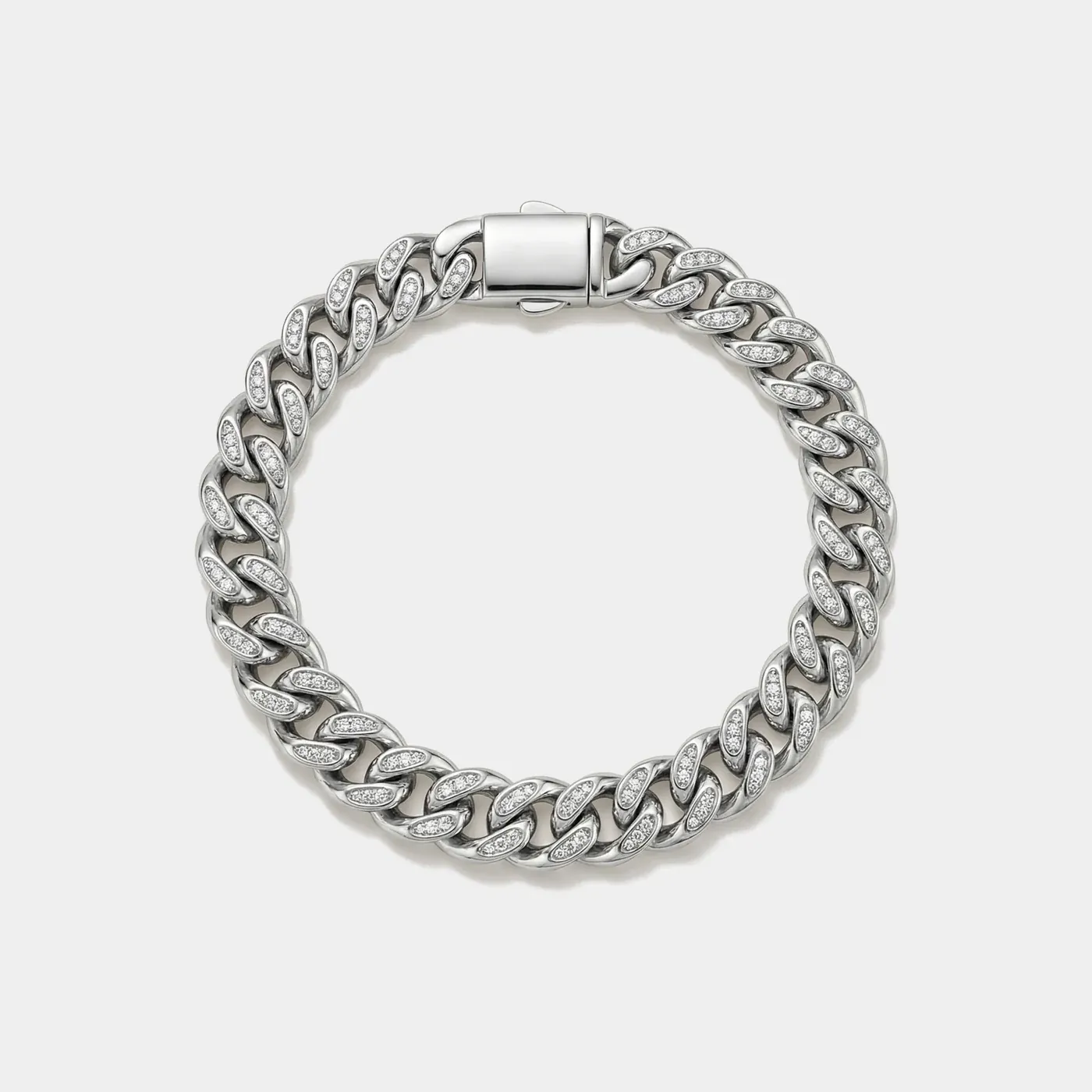
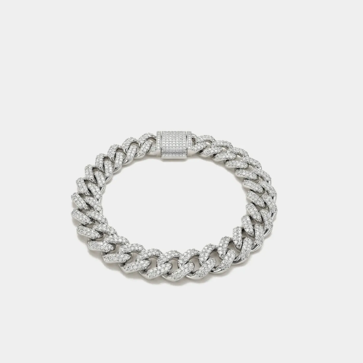
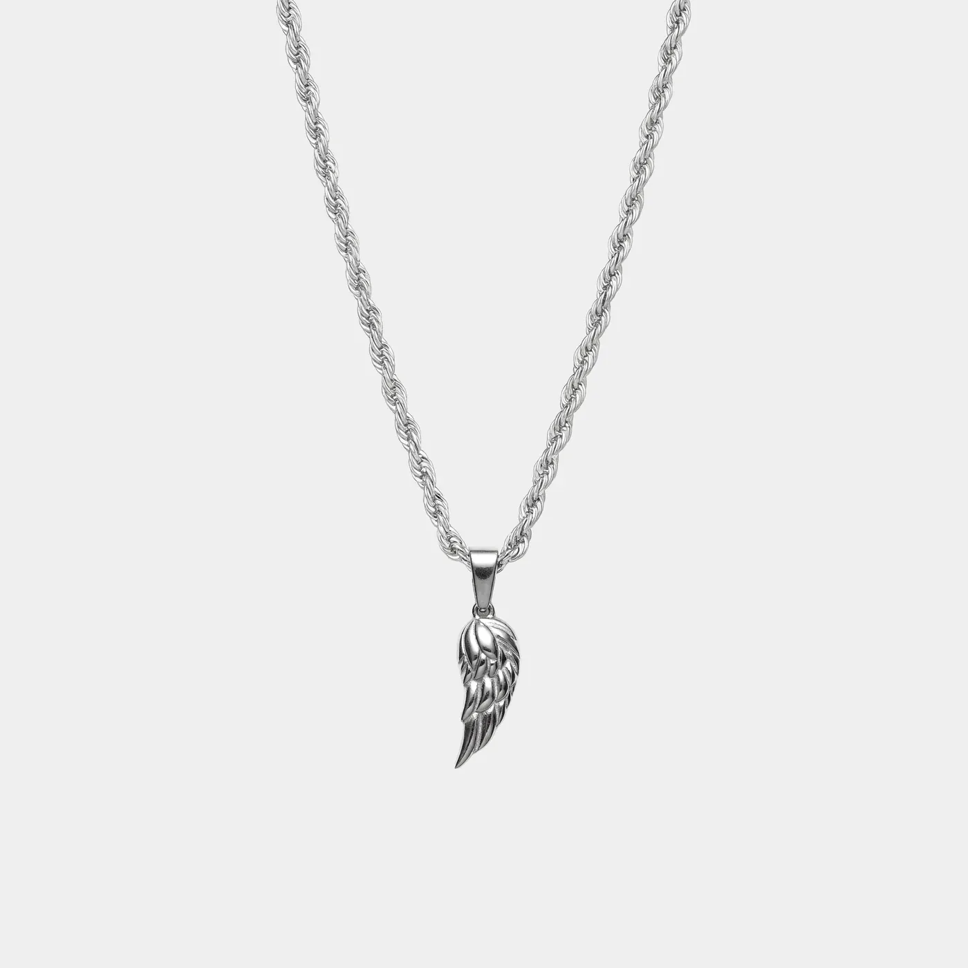
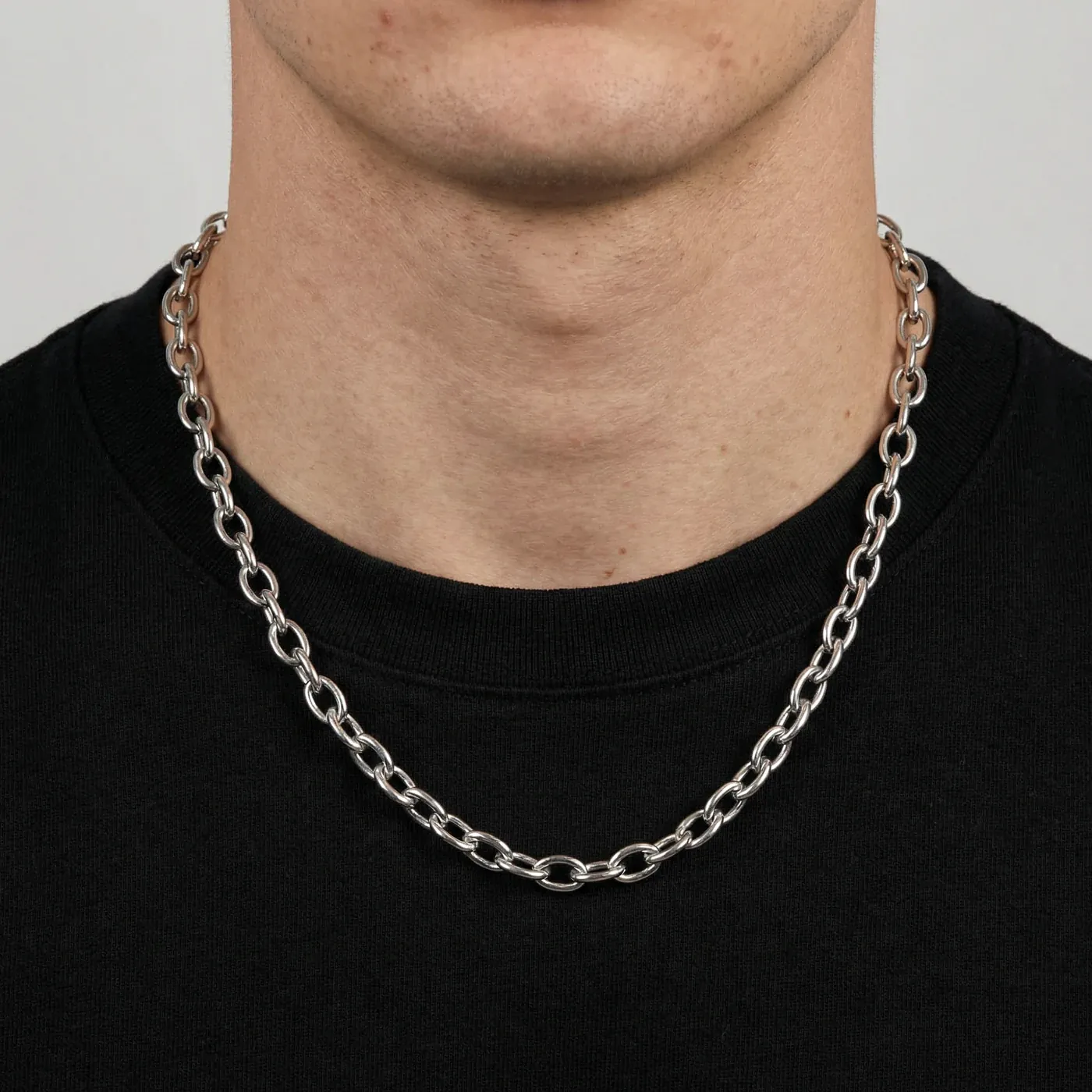
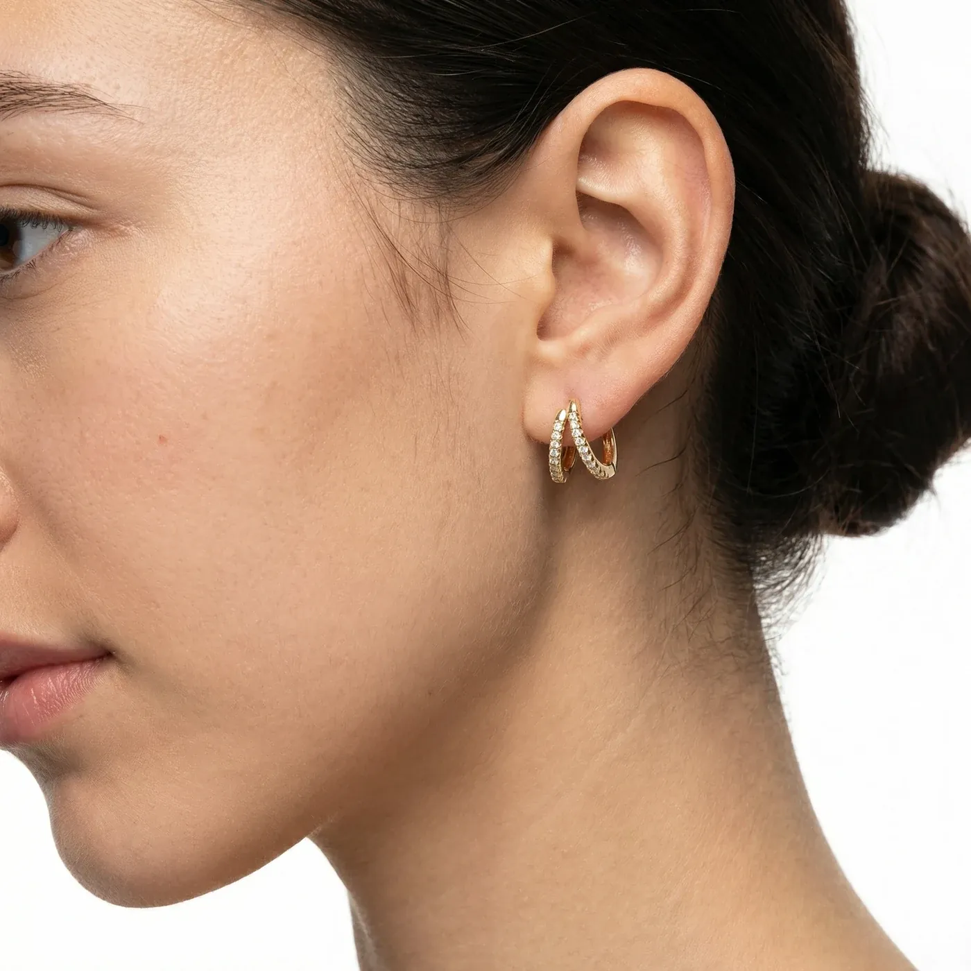
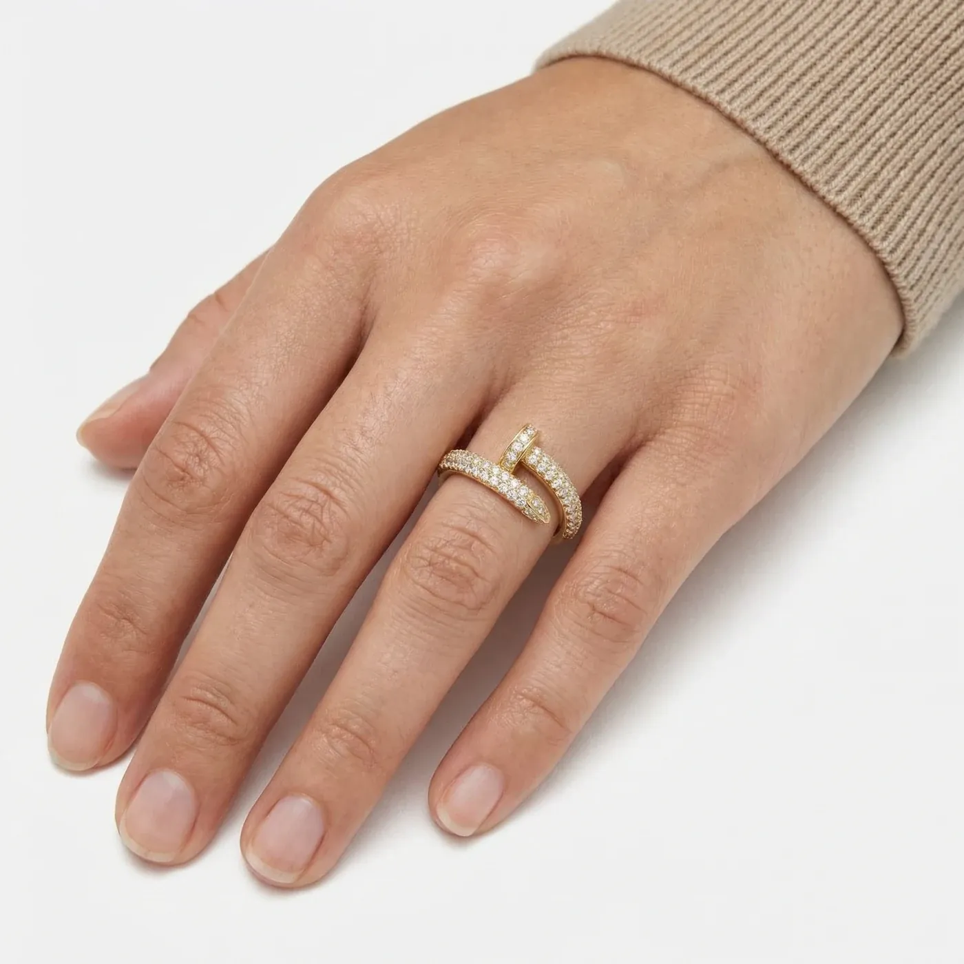
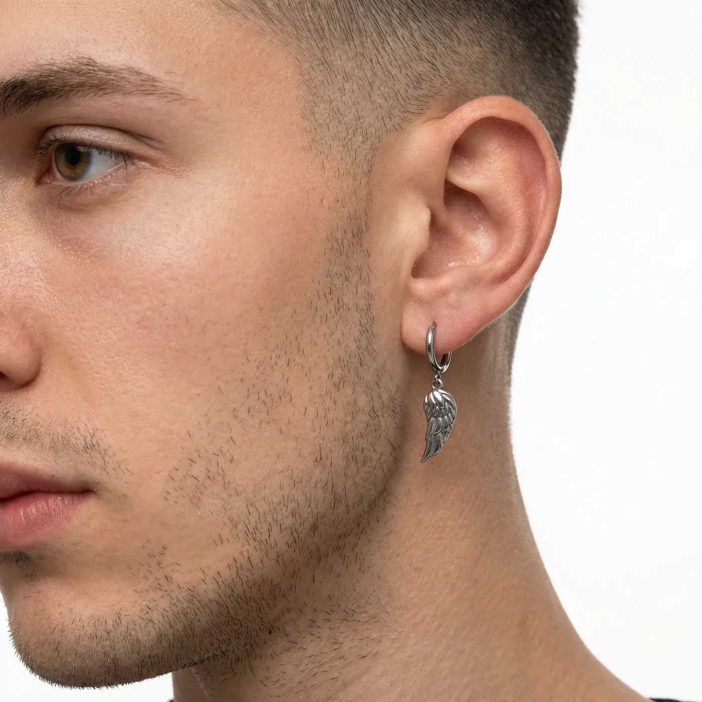
Jewellery asks a lot of an image: the form needs to read immediately, the surface needs to feel convincing, and the piece needs a believable sense of scale. My work combined AI-assisted image creation with retouching to build a consistent visual collection across rings, chains, earrings, bracelets, and pendants.
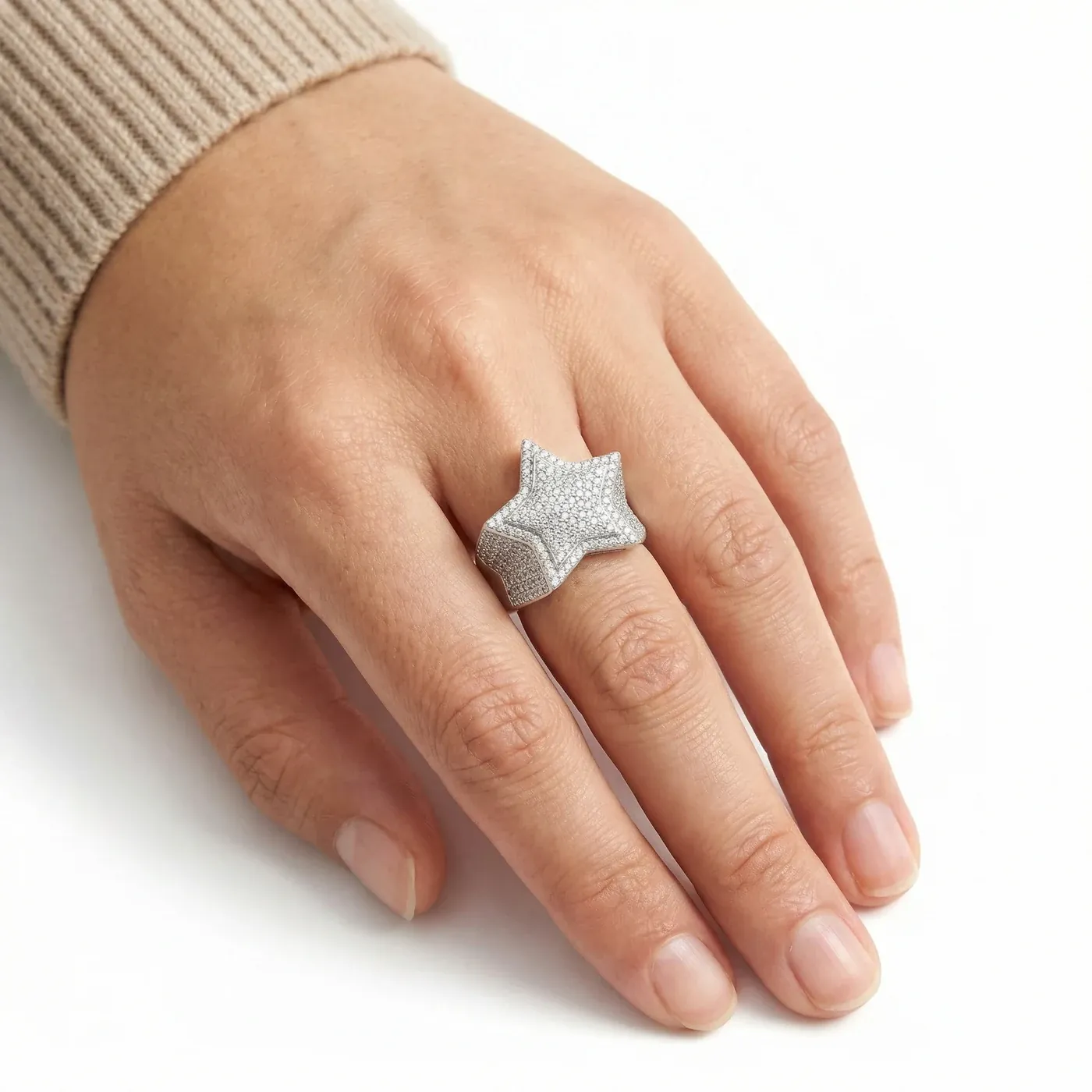
THE CREATIVE APPROACH
Establish the visual language
Use the identity’s restrained palette and editorial direction as a common reference for the collection.
Create and refine the imagery
Bring AI-assisted image production and retouching together, with attention to form, finish, lighting, and the way each piece is presented.
Think across the collection
Balance individual product detail with a consistent look across isolated images, worn views, and the storefront.
A consistent collection.
Selected final images / AI-assisted production & retouching
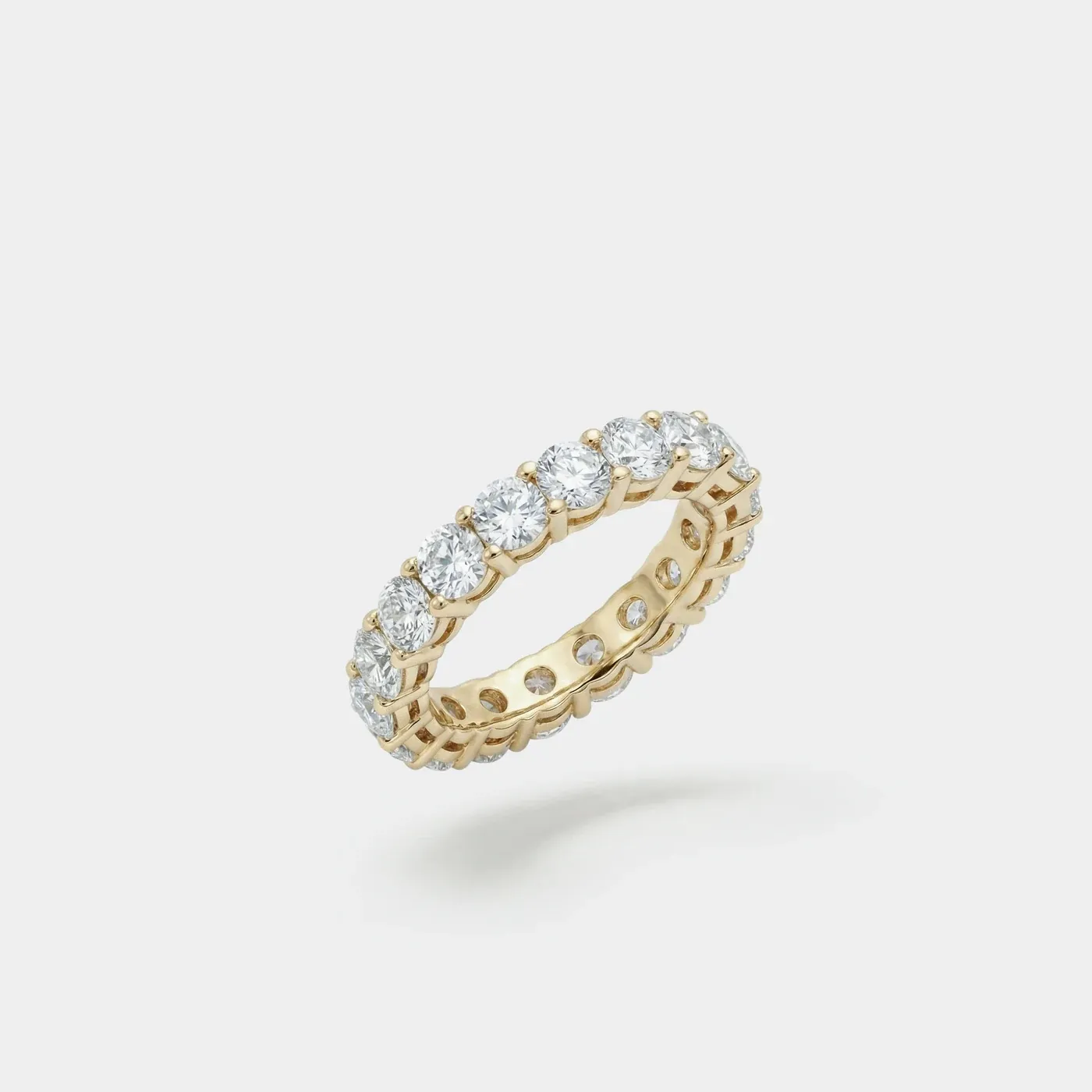
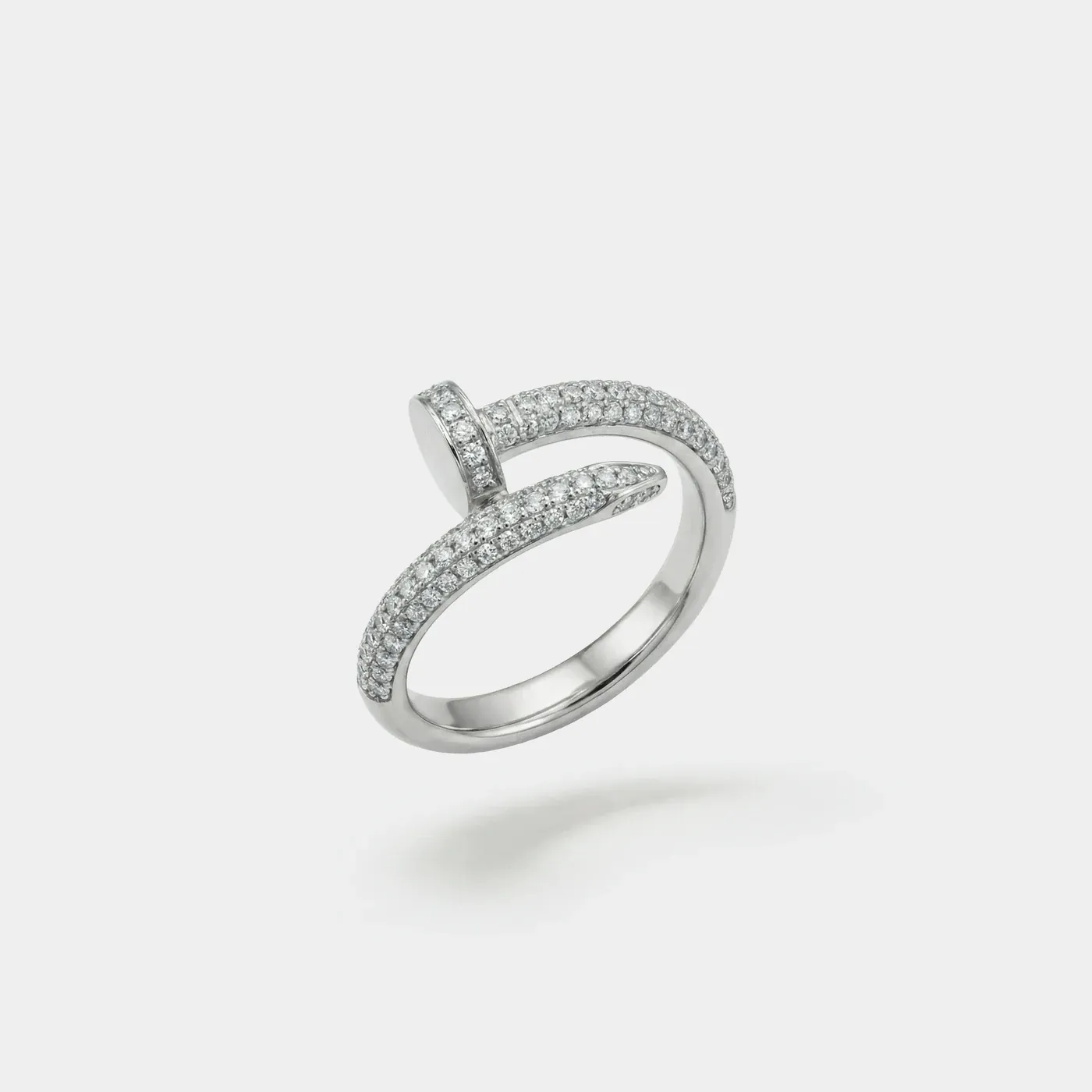
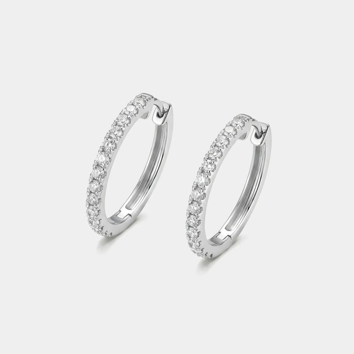
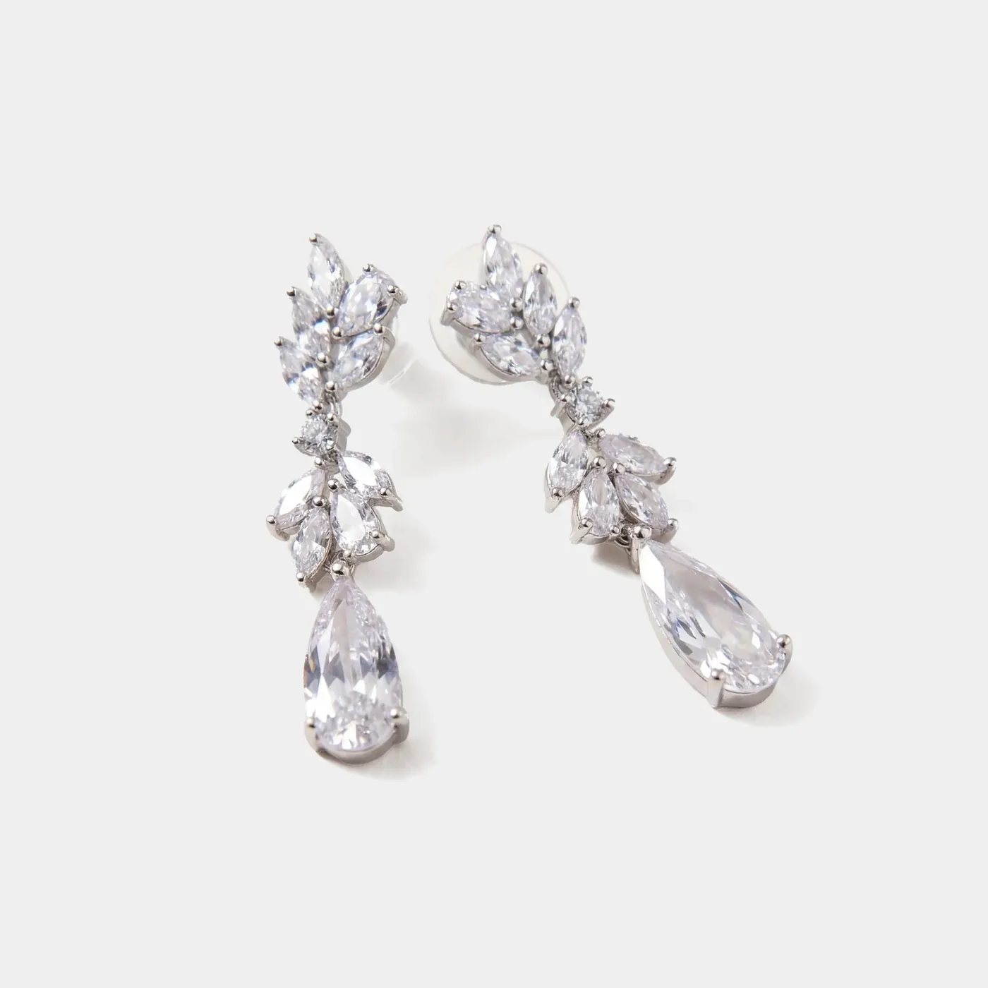
OBJECT / WORN
Give the piece a human scale.
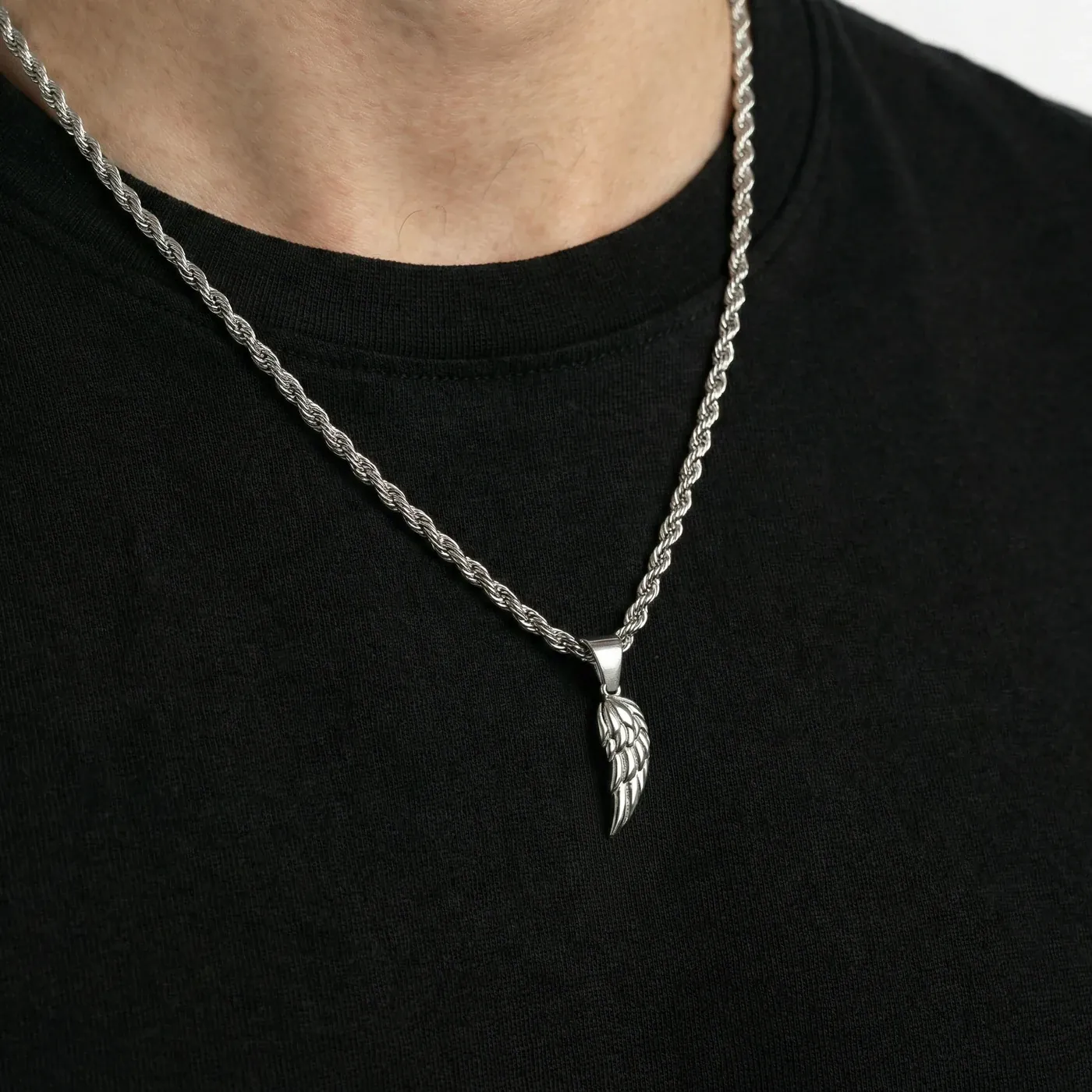
An isolated image explains the object. An on-model image explains its presence. Paired together, they show the same piece as a design and as something worn — its proportion, its relationship to the body, and the details that become visible at a closer distance.
04 / THE DIGITAL EXPERIENCE
From image to interaction.
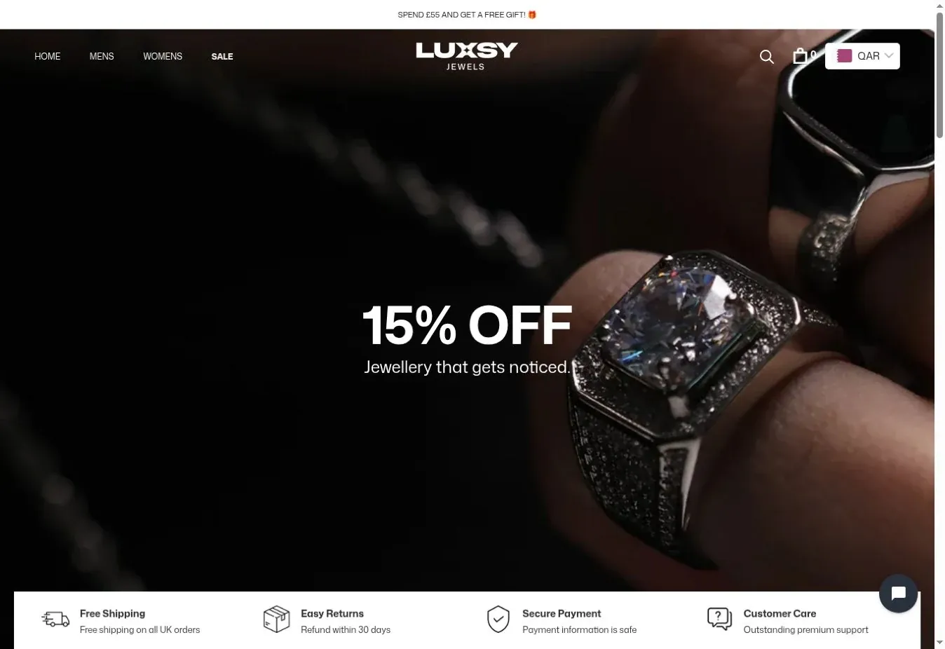
I also designed the Luxsy website, bringing the identity and imagery into a complete shopping experience. The homepage gives the jewellery a strong visual introduction; the product pages bring isolated and worn views together with the information a visitor needs to choose a piece.
THE PRODUCT PAGE
See the piece.
Understand the detail.
The same visual discipline continues through the store: clear navigation, prominent imagery, and a direct path from browsing the collection to examining a product. These captures show the live website, where the brand system meets everyday use.
luxsyjewels.com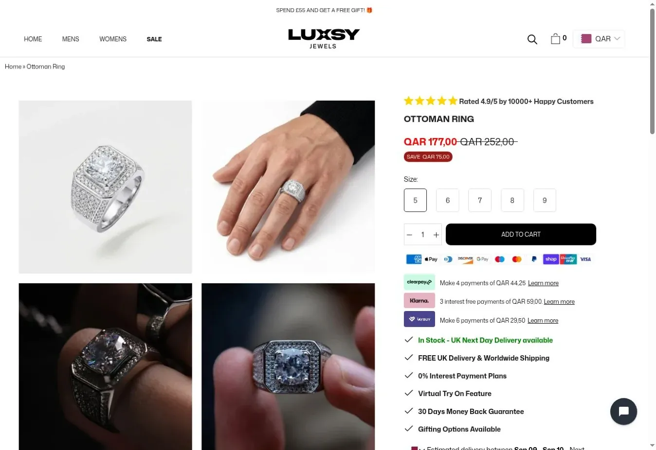
LUXSY JEWELS / BY EL FLORENTINO
The mark. The image. The experience.
A connected body of work across identity, image production, and website design — built to make Luxsy recognisable wherever the collection appears.