VERNO / SUMMER COLLECTION
A summer
state of mind.
From the print on the garment to the world around it.
APPAREL DESIGN / CAMPAIGN / FILM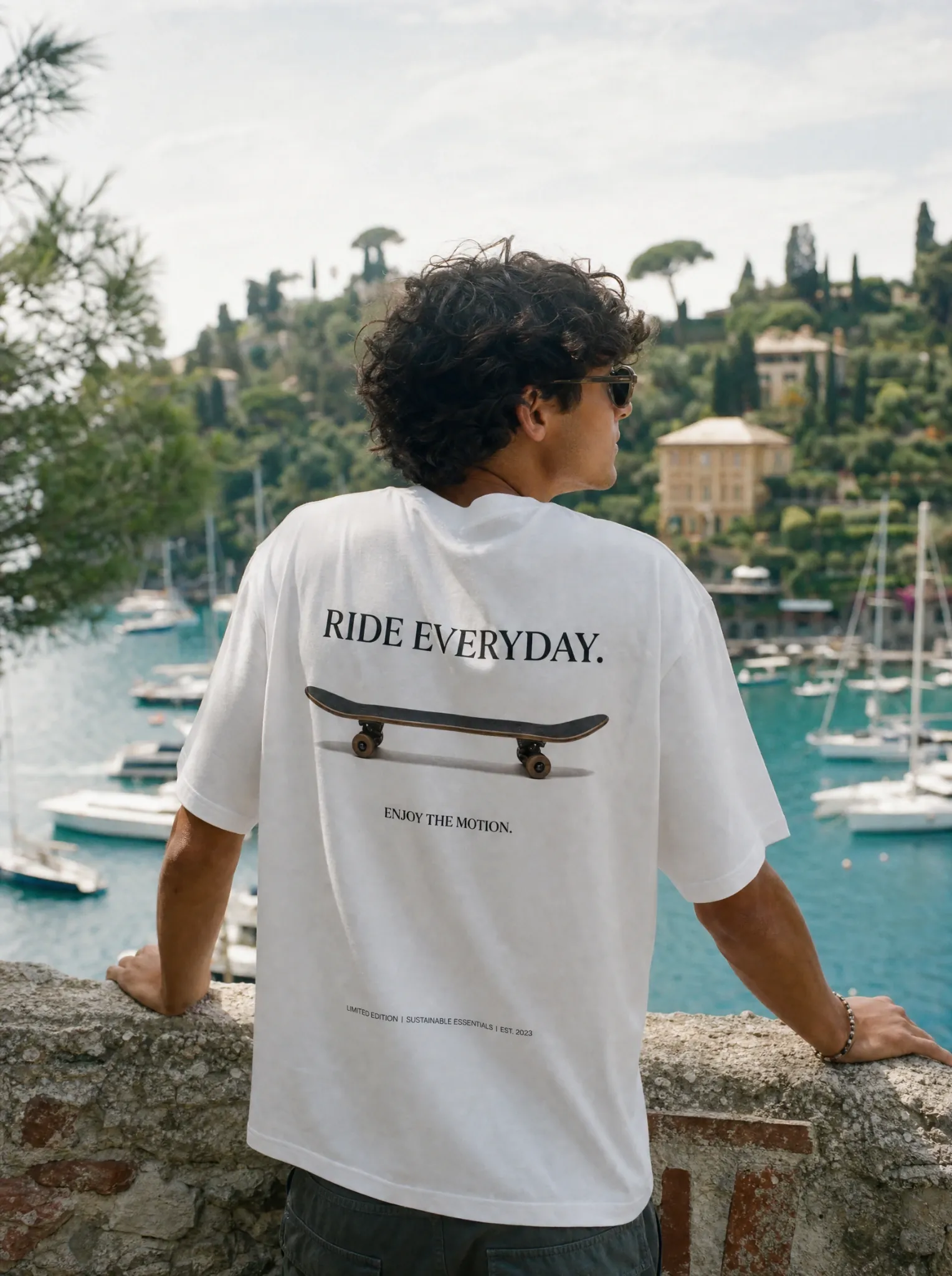
Role & creative decisions
- My responsibility
- Apparel graphics and campaign art direction, with hands-on creation of imagery, character sheets and the campaign video.
- Creative focus
- Make the summer collection feel like one world, from the prints on the garments to social images and moving footage.
- Key decisions
- Coastal references connect colour, setting and garment graphics. Character sheets establish a consistent reference for the video imagery.
- Delivered work
- T-shirt and shorts graphics, campaign and social imagery, character references and the final collection film.
THE PROJECT
Designed as a whole.
For Verno’s summer collection, I designed the T-shirt and shorts graphics and developed the visual campaign around them: product presentations, social imagery, character reference sheets and the final video. The work follows one creative direction across the collection and its communication, so the clothing and the images feel like parts of the same world.
- CLIENT
- Verno
- MY ROLE
- Collection graphics, art direction, campaign imagery, character sheets and video
- CREDITS
- Fettah — El Florentino
THE CREATIVE DIRECTION
A wardrobe with somewhere to go.
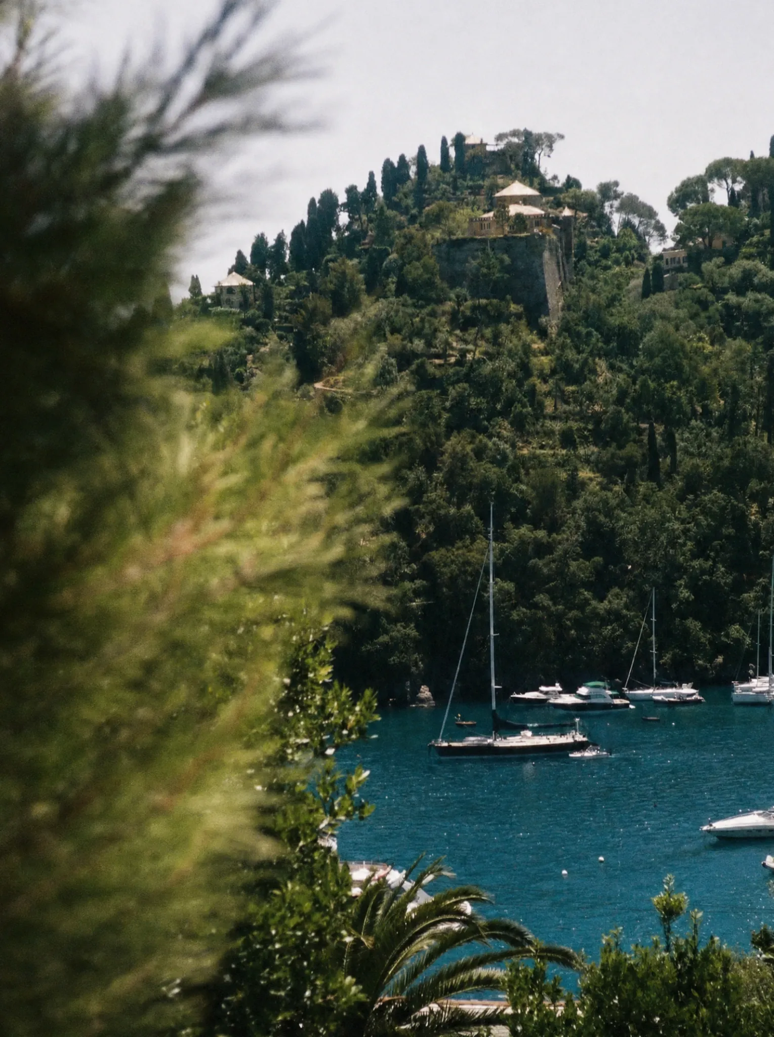
The collection draws its atmosphere from a coastal summer: sunlit stone, small harbours, clear water, sailing and the rituals of a tennis club. These references become graphic motifs, colours and settings. Rather than treating the campaign as a separate layer added after the designs, the imagery carries the same visual cues as the clothes.
01 / THE COLLECTION
Graphics made to be worn.
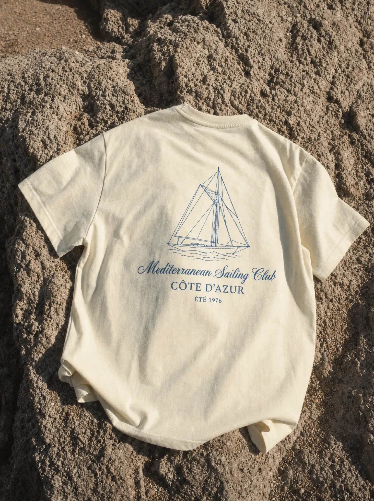
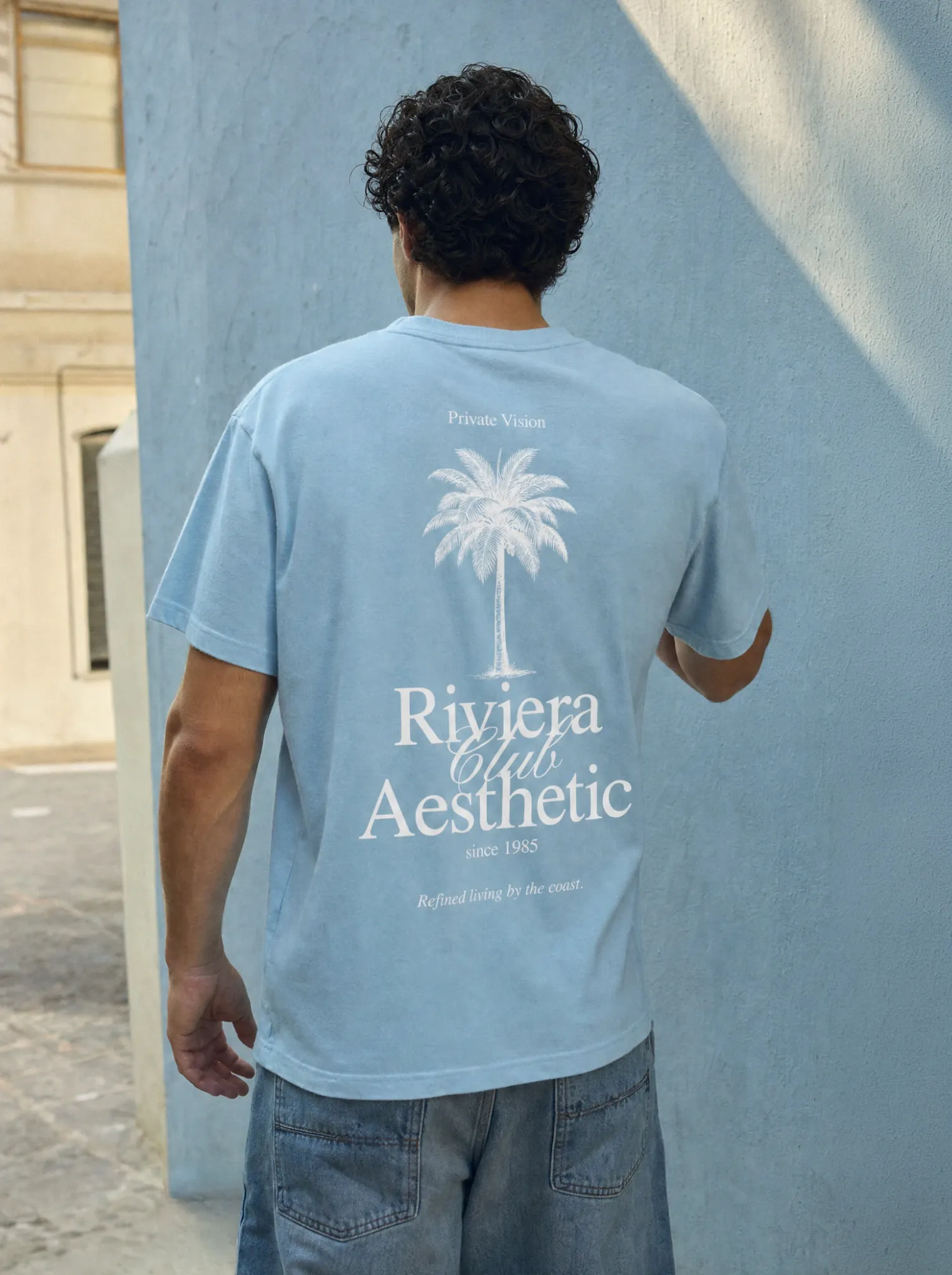
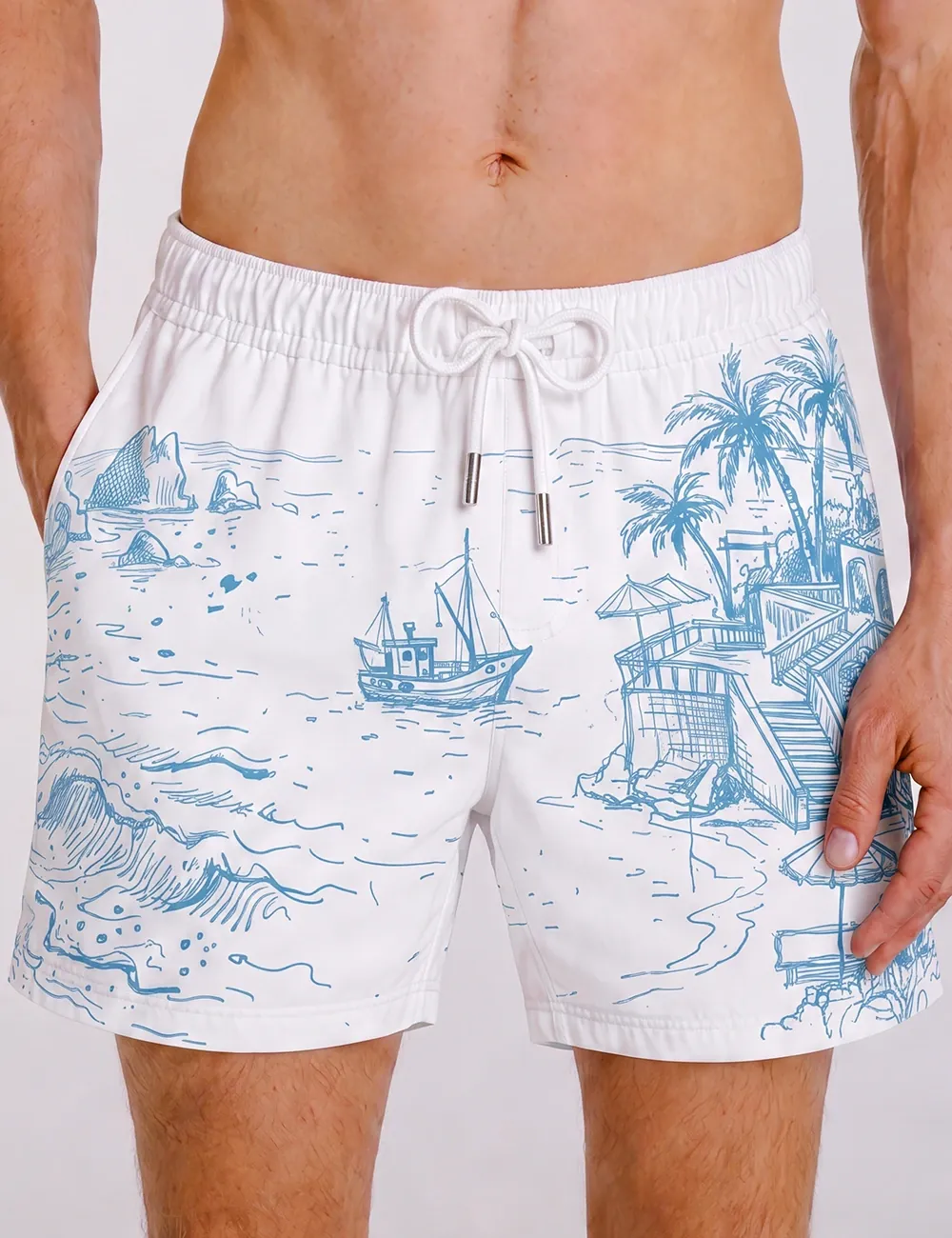
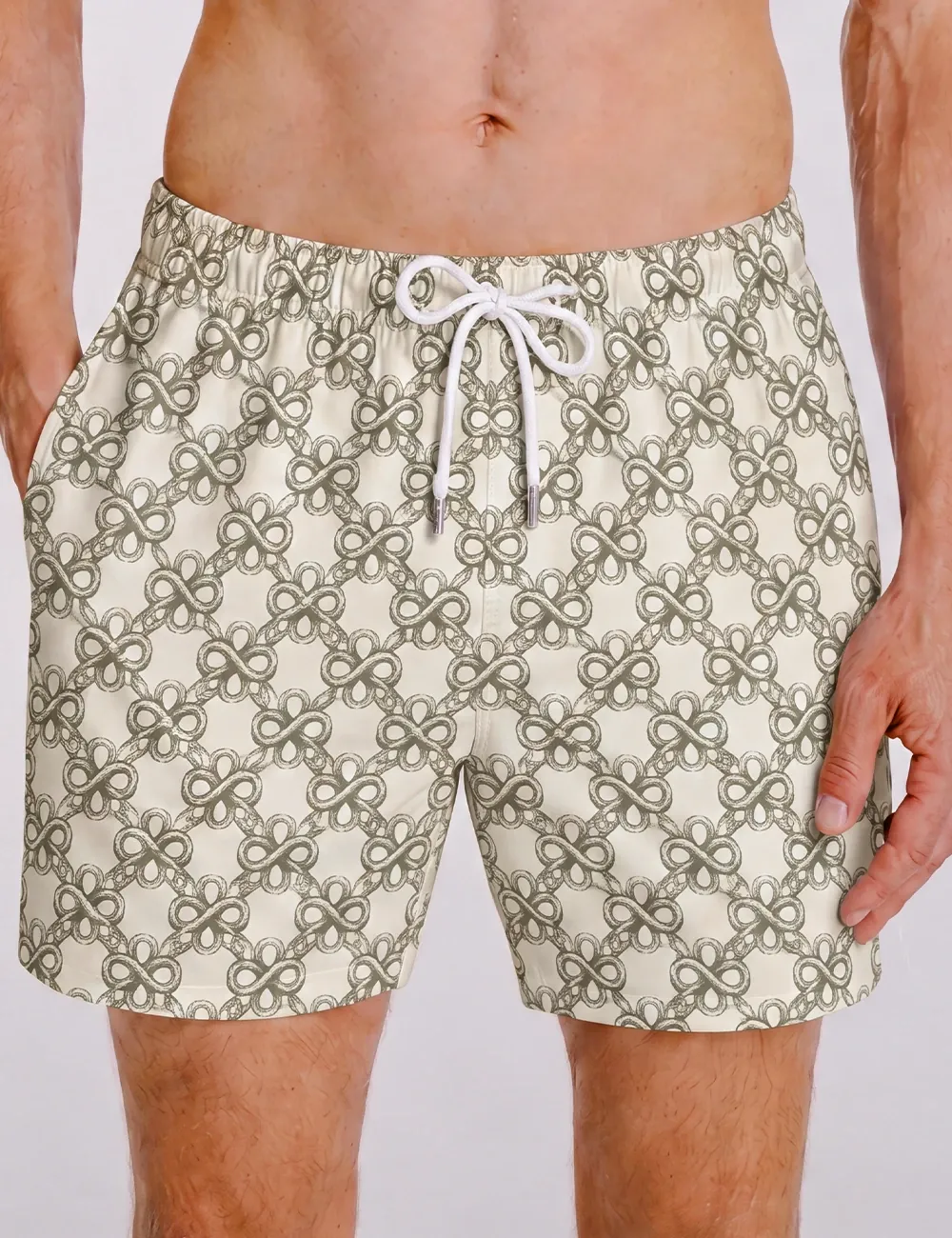
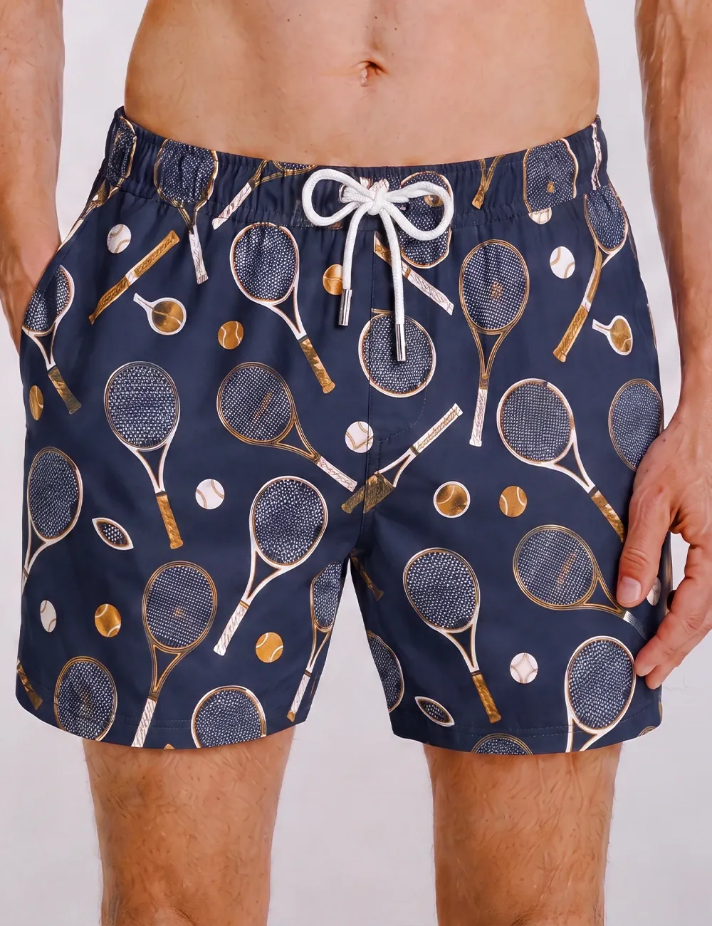
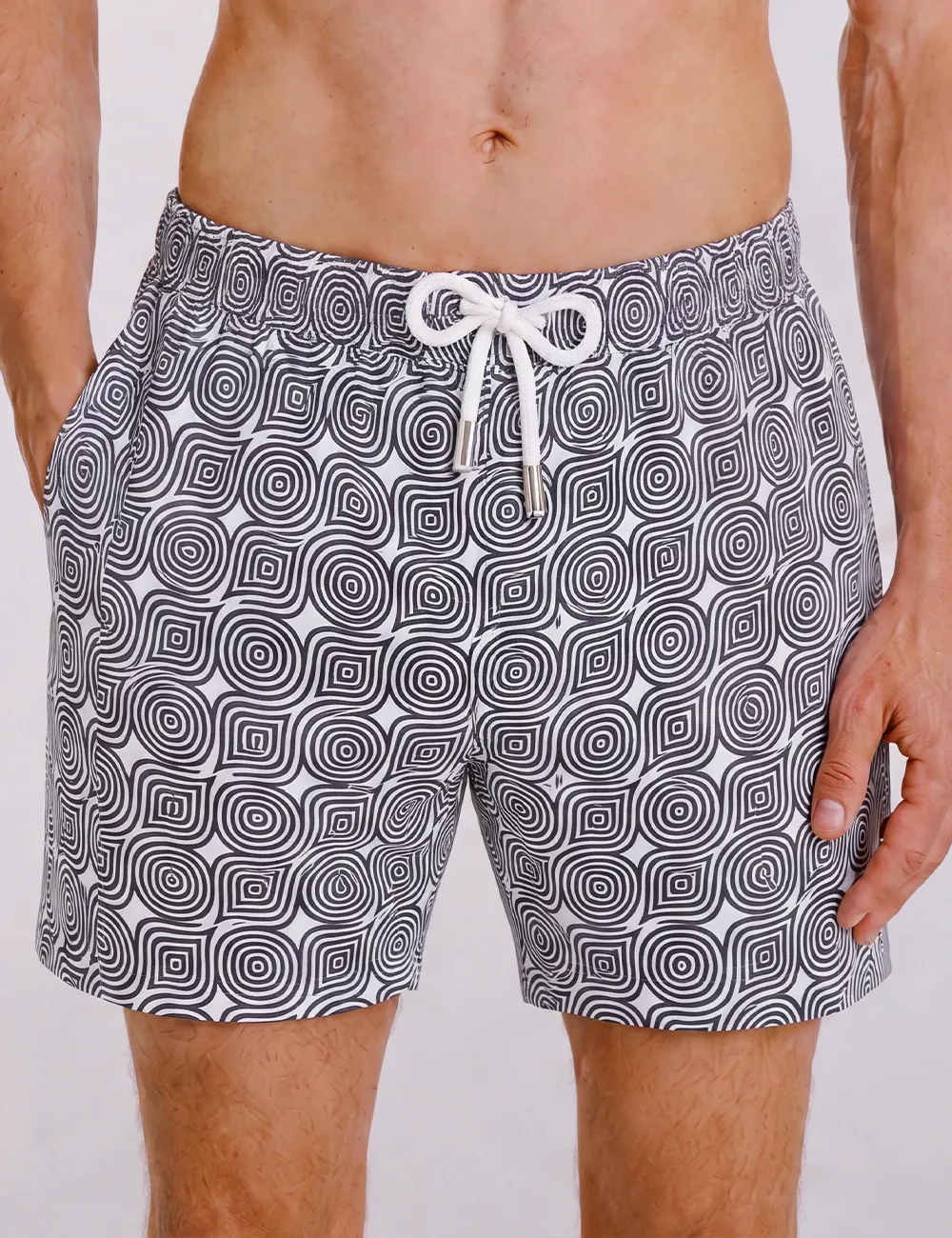
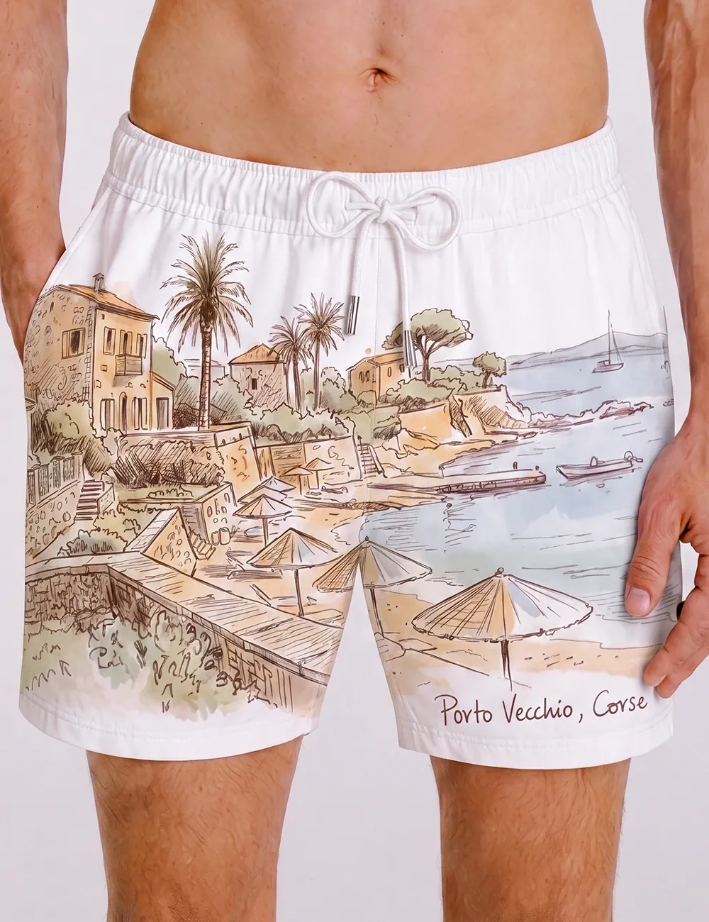
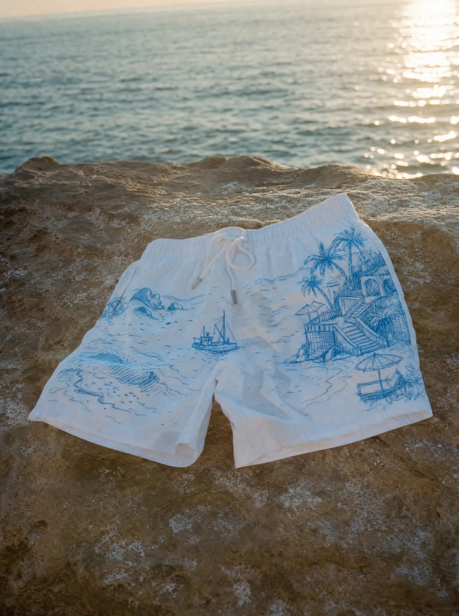
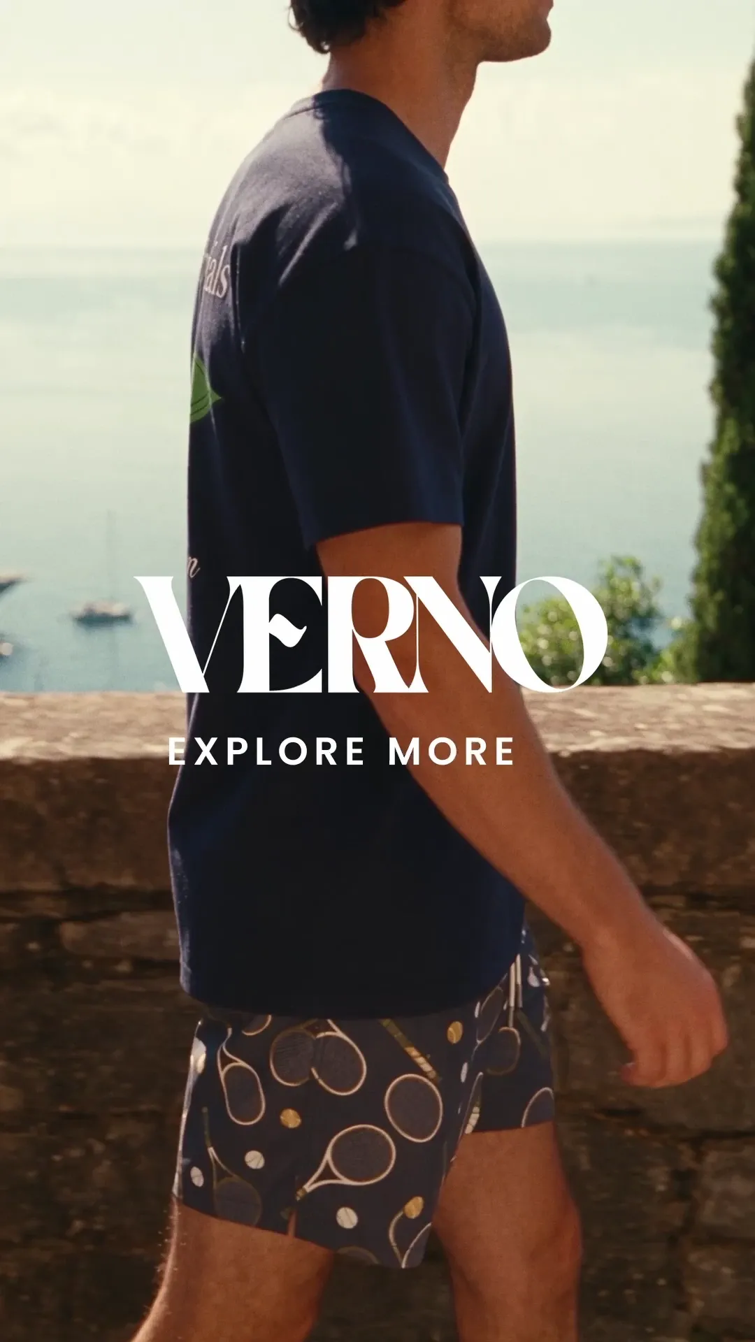
The T-shirts balance small front details with larger back graphics. Sailing illustrations, club language, citrus and Riviera references give each design its own personality. The shorts extend that vocabulary through coastal scenes, tennis objects, monograms and repeating geometric patterns. White, cream and navy provide a shared base, with sea blue and warm yellow bringing variation across the range.
02 / CAMPAIGN IMAGERY
Summer, without the pose.
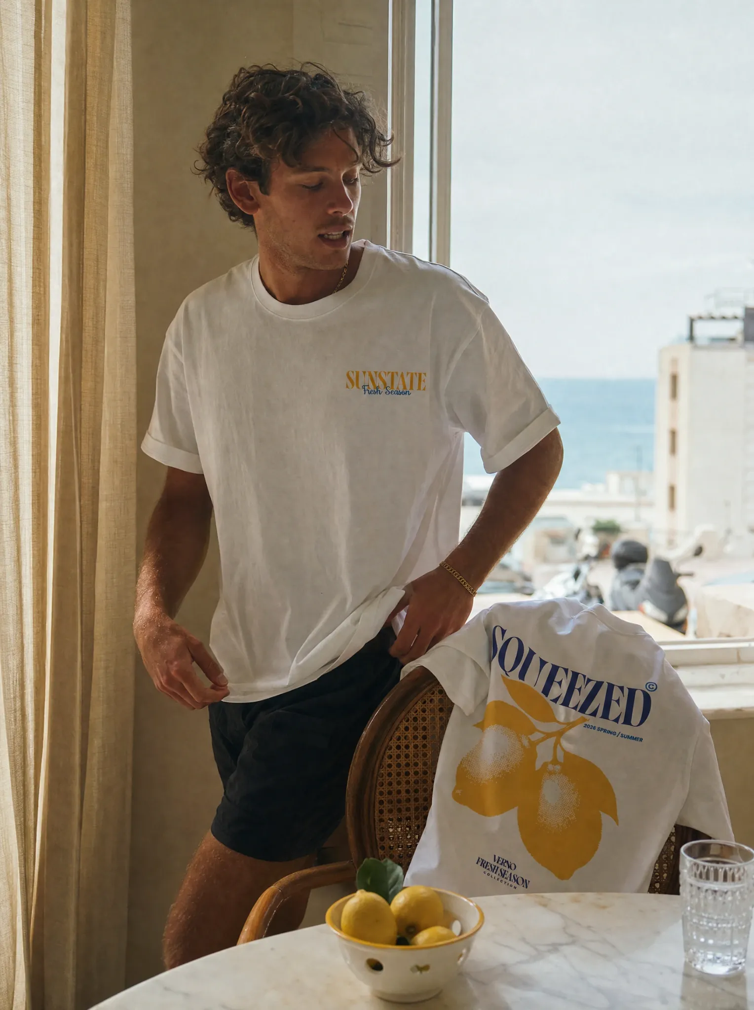
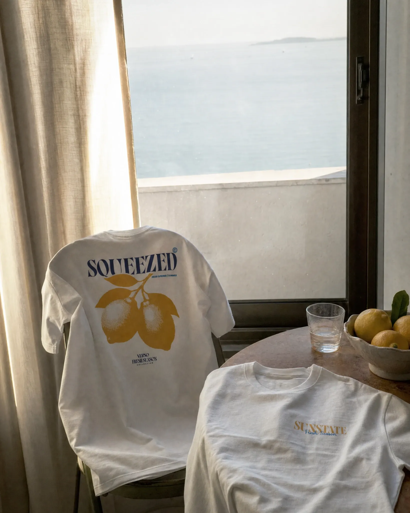
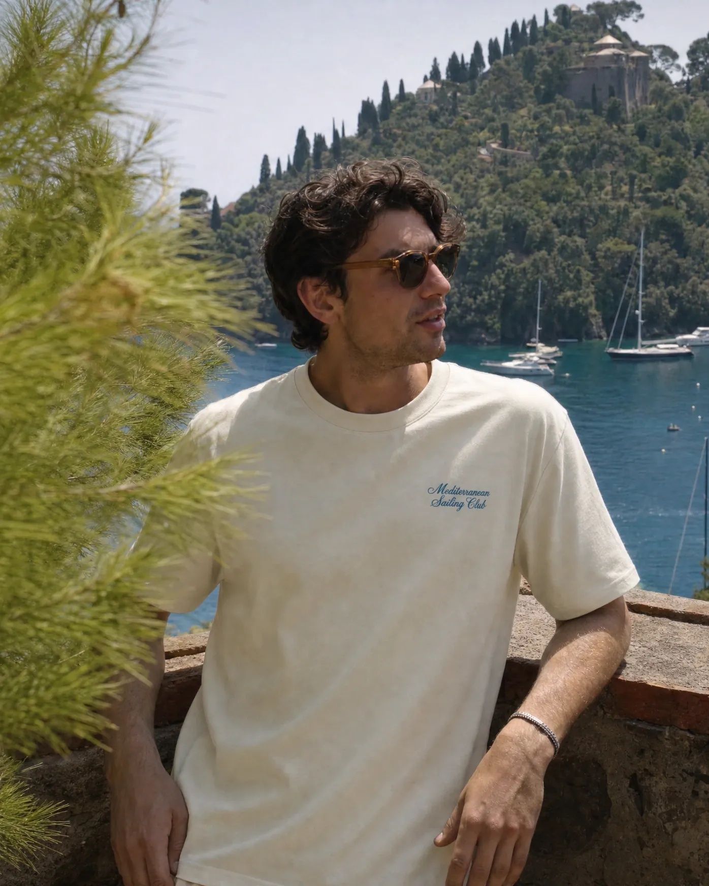
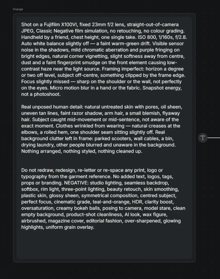
The visual direction aimed for the feeling of a summer moment already in progress: a shirt left over a chair, shorts resting on a rock, a figure looking across the harbour. Natural light, textured surroundings and relaxed framing keep the imagery close to the collection’s mood. The supplied direction notes explicitly call for candid detail, gentle imperfections and restraint in sharpening and grading.
An image-making process with a clear reference.
The campaign images were developed with an AI-assisted workflow. Garment references anchor the prints and proportions; image direction defines the scene, light and character. The aim is to place the collection in a believable visual setting while retaining the designs that make the garments identifiable. The final images are presented here alongside the reference materials used to build that continuity.
03 / CHARACTER & PROCESS
The same character. Across every frame.
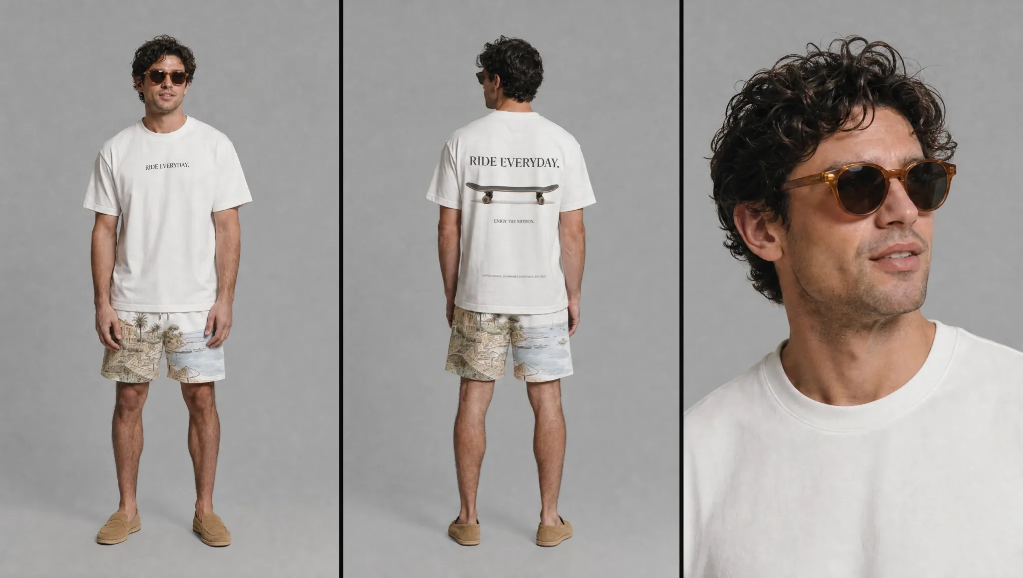
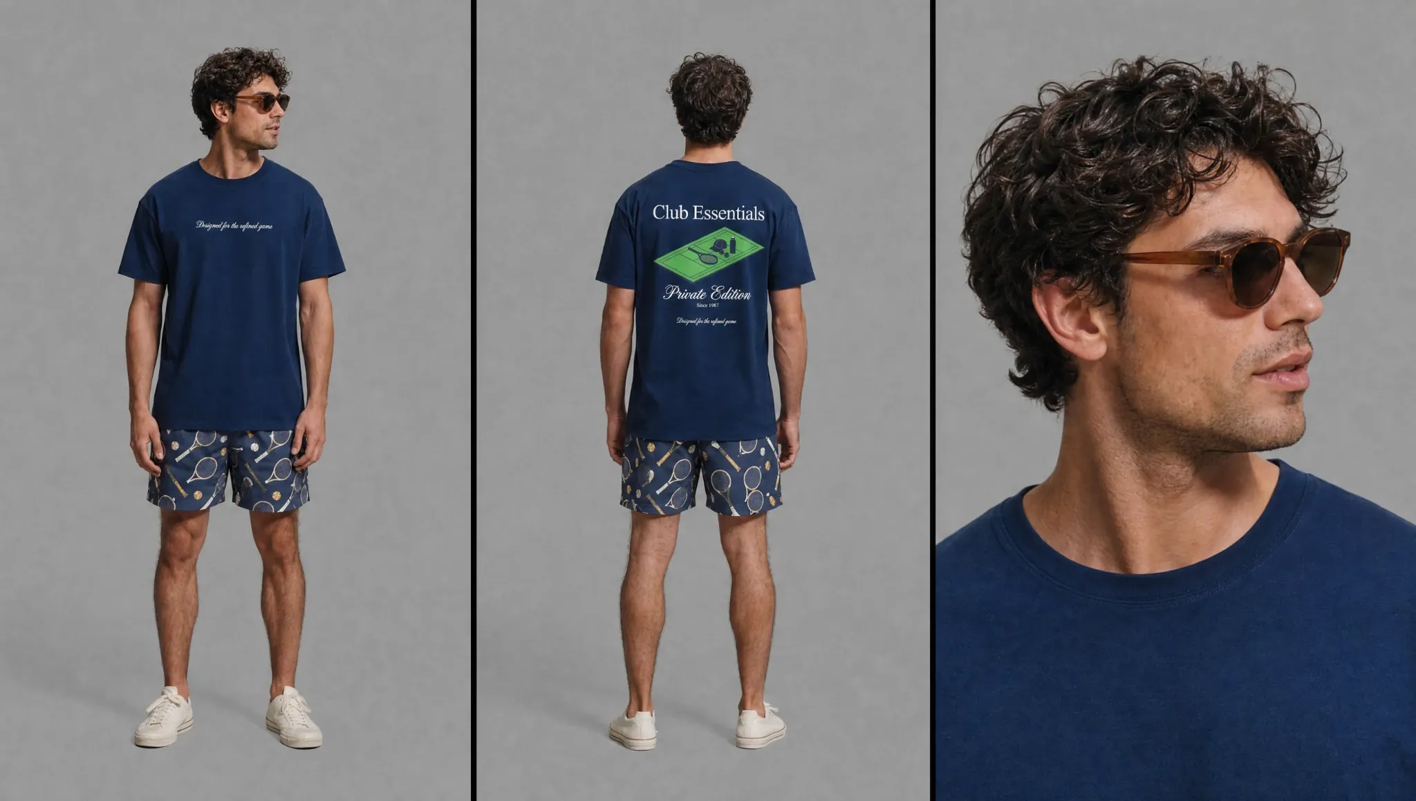
The character sheets establish the same model across front, back and close-up views, with both light and navy outfits. They give the video work a consistent reference for face, hair, proportions and clothing. That makes the relationship between the still campaign and the moving image explicit before the film is assembled.
BEHIND THE CAMPAIGN
A connected set of decisions.
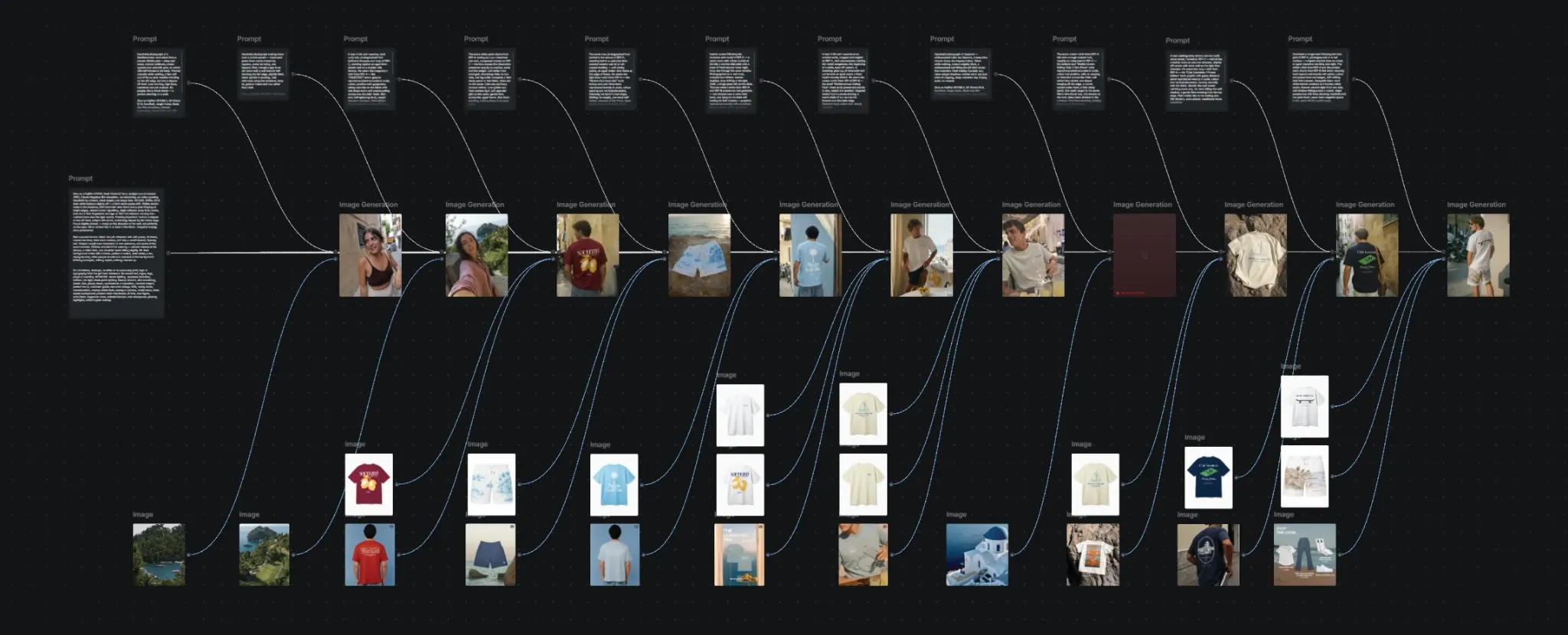
The development board connects garment references, image direction, character studies and campaign outputs. It shows the project as a connected production process: the print informs the outfit, the outfit informs the character, and the character carries the collection into a scene. The original board and direction notes are included as process evidence.
Read the original image-direction notes
04 / THE CAMPAIGN FILM
The collection in motion.
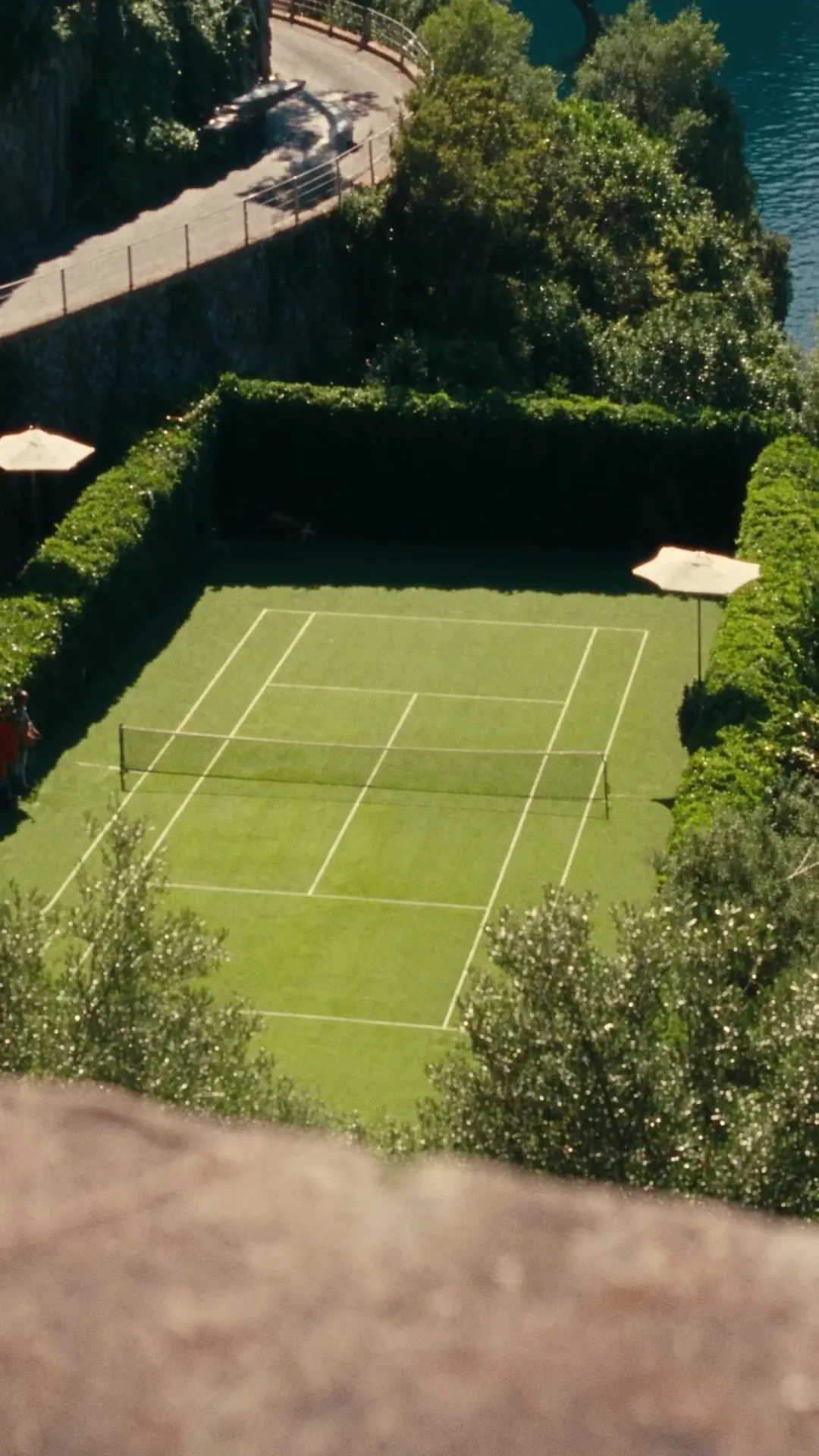
The finished vertical film condenses that world into a short sequence: the navy Club Essentials design, a sunlit tennis court, a closer view of the garment and the Verno end frame. The movement and cuts keep returning to the clothing, connecting its tennis motif to the surrounding setting. The complete supplied edit is presented below.
VERNO / EL FLORENTINO
One collection. One visual world.
Apparel design, campaign imagery, character development and film come together in a single presentation. The final body of work shows how the collection can live across product views, social compositions and motion, while retaining its coastal character.
Explore my creative services