Oculus.
A clearer way to see the brand.
Brand identity · Print · Signage · Digital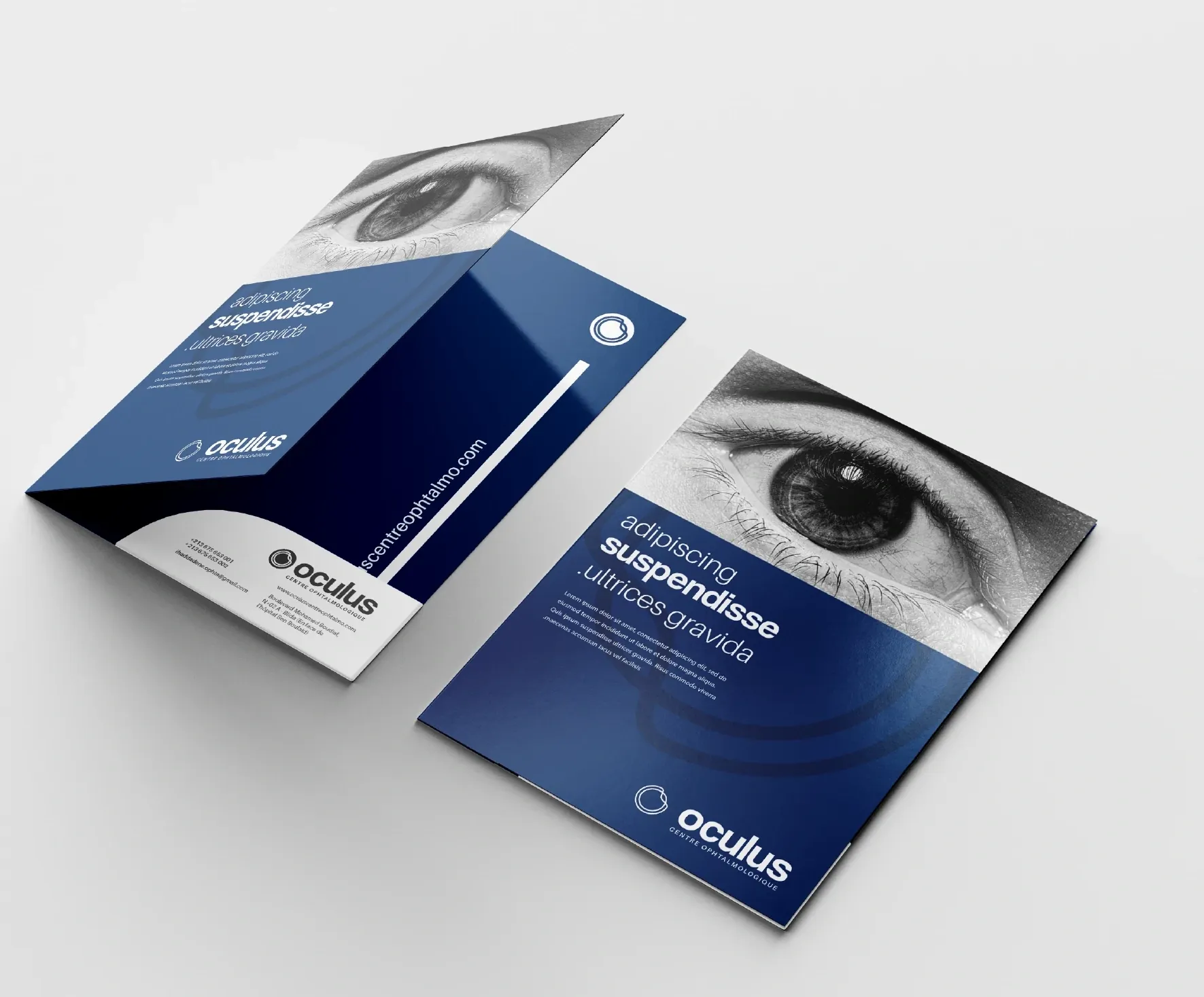
THE PROJECT
Clarity, from the first impression.
Oculus is an ophthalmology centre whose identity takes its starting point from the eye itself. The project brings a distinctive symbol, a flexible family of lockups, and a consistent visual language into the everyday materials of the practice — from a business card to a consultation-room sign.
- CLIENT
- Oculus Centre Ophtalmologique
- DISCIPLINE
- Visual identity & brand applications
- CREDITS
- Fettah — El Florentino · Zone Agency
01 / THE CONCEPT
The eye becomes the identity.
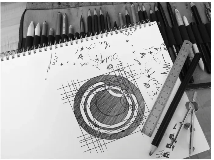
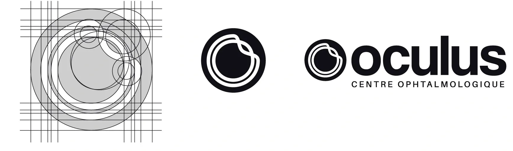
The original concept studies a section through the eye, simplifying its curves into a compact circular mark. Two interlocking lines refer to the two doctors and their complementary fields of practice. An upward orientation gives the form a sense of direction, while the enclosing circle brings the elements together as one centre.
02 / THE DESIGN SYSTEM
A recognisable form. Room to adapt.
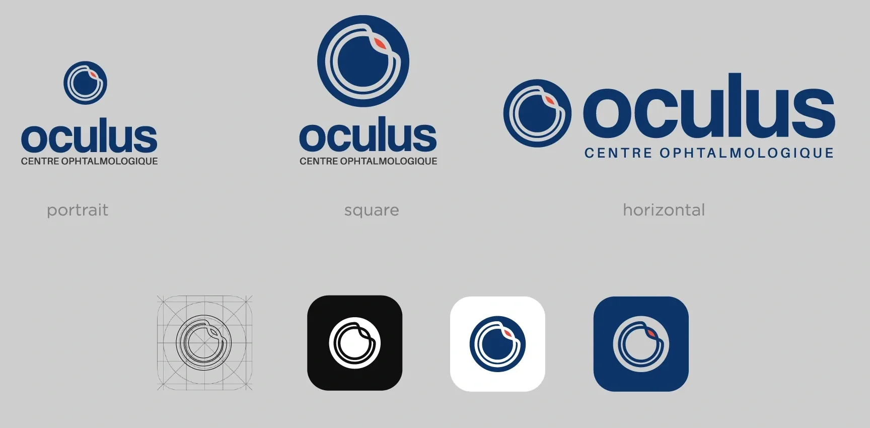
The symbol works on its own and alongside the Oculus name. Portrait, square, and horizontal arrangements make the identity adaptable to narrow printed formats, digital profiles, and larger applications. The same recognisable geometry carries through every version.
COLOUR & IMAGE
A clinical blue.
A human point of contrast.
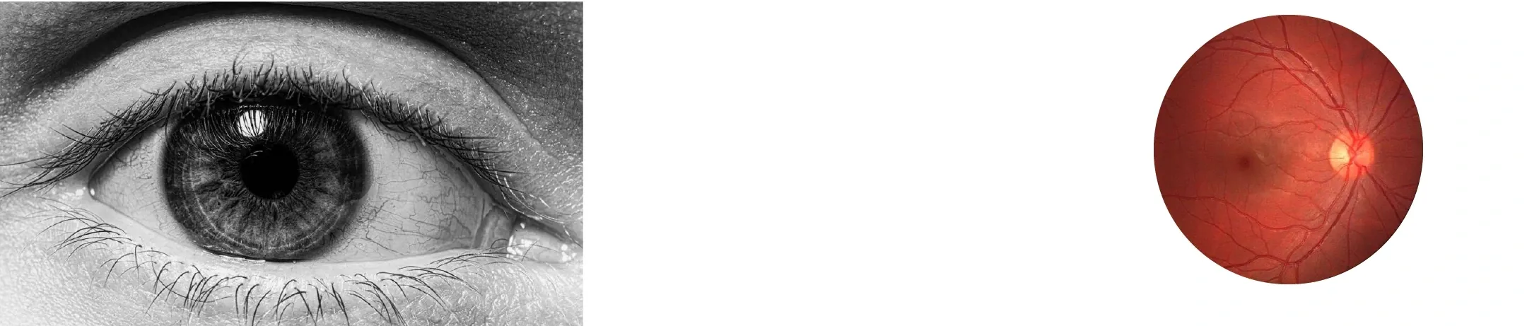
Deep blue anchors the identity, supported by a lighter blue, mint, and charcoal. The orange-red accent comes from the internal view of the eye shown in the original research, creating a small point of contrast within the symbol. Black-and-white photography gives the colour system space to remain distinctive.
Deep blue
#0D3569
Primary identityBlue
#4086C0
Supporting colourMint
#88F0BF
Supporting colourOrange-red
#E94C3B
AccentCharcoal
#383838
NeutralTYPOGRAPHY
A hierarchy built
for information.
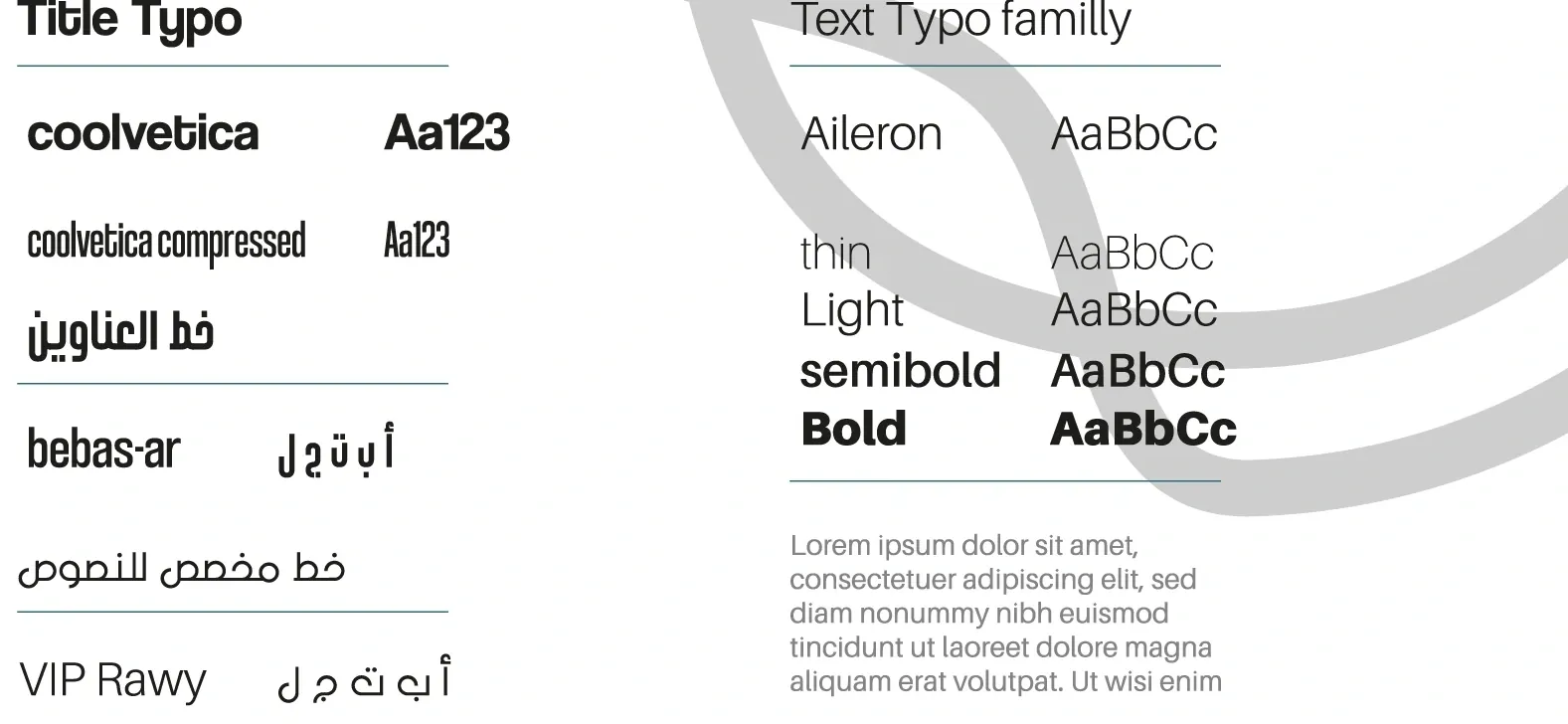
The published typographic system pairs Coolvetica for titles with Aileron for body text. Different weights establish a clear reading order. Arabic counterparts — Bebas-ar for titles and VIP Rawy for text — extend the system across Arabic, French, and English communication.
03 / PRINT & STATIONERY
A system for everyday use.
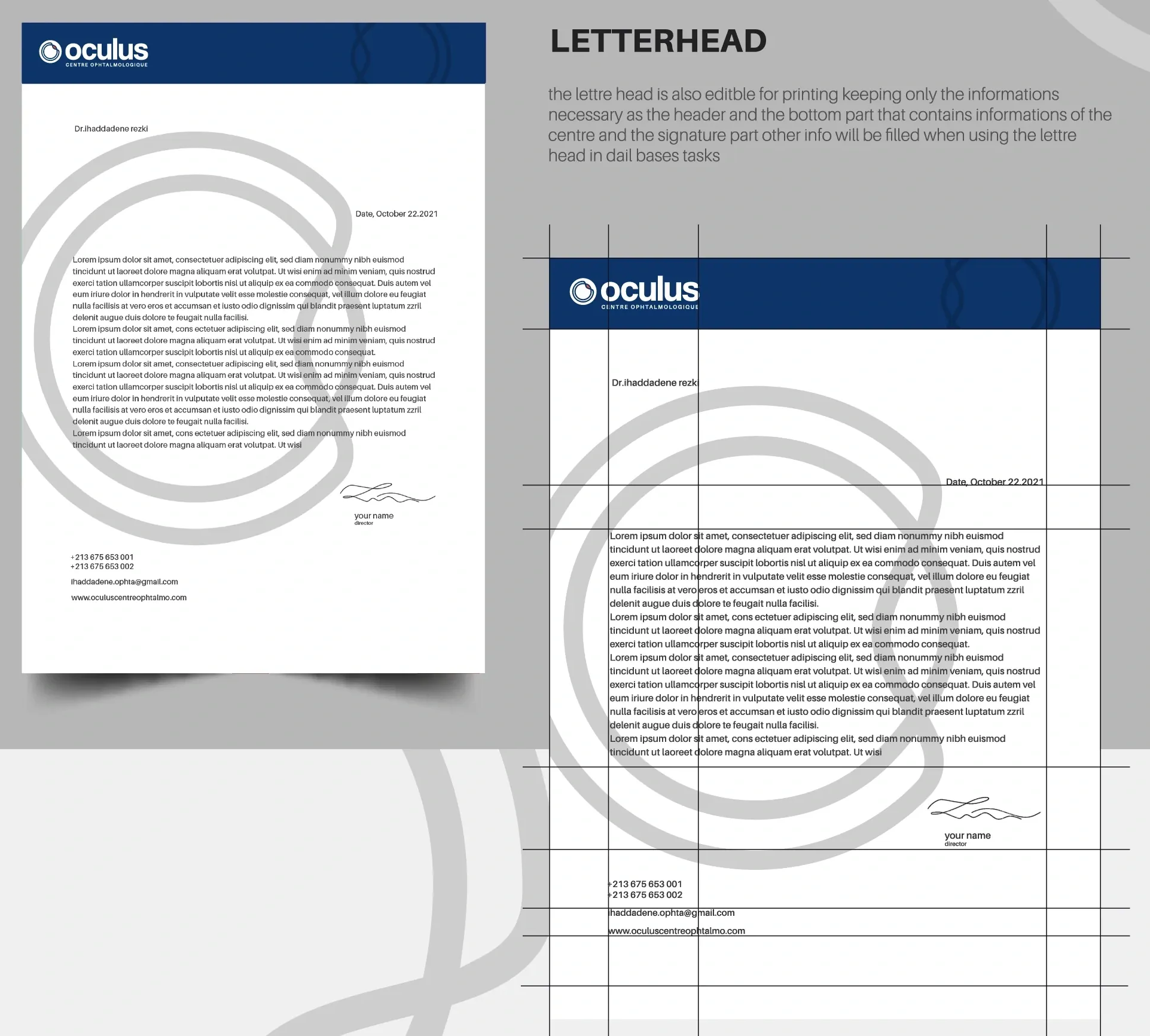
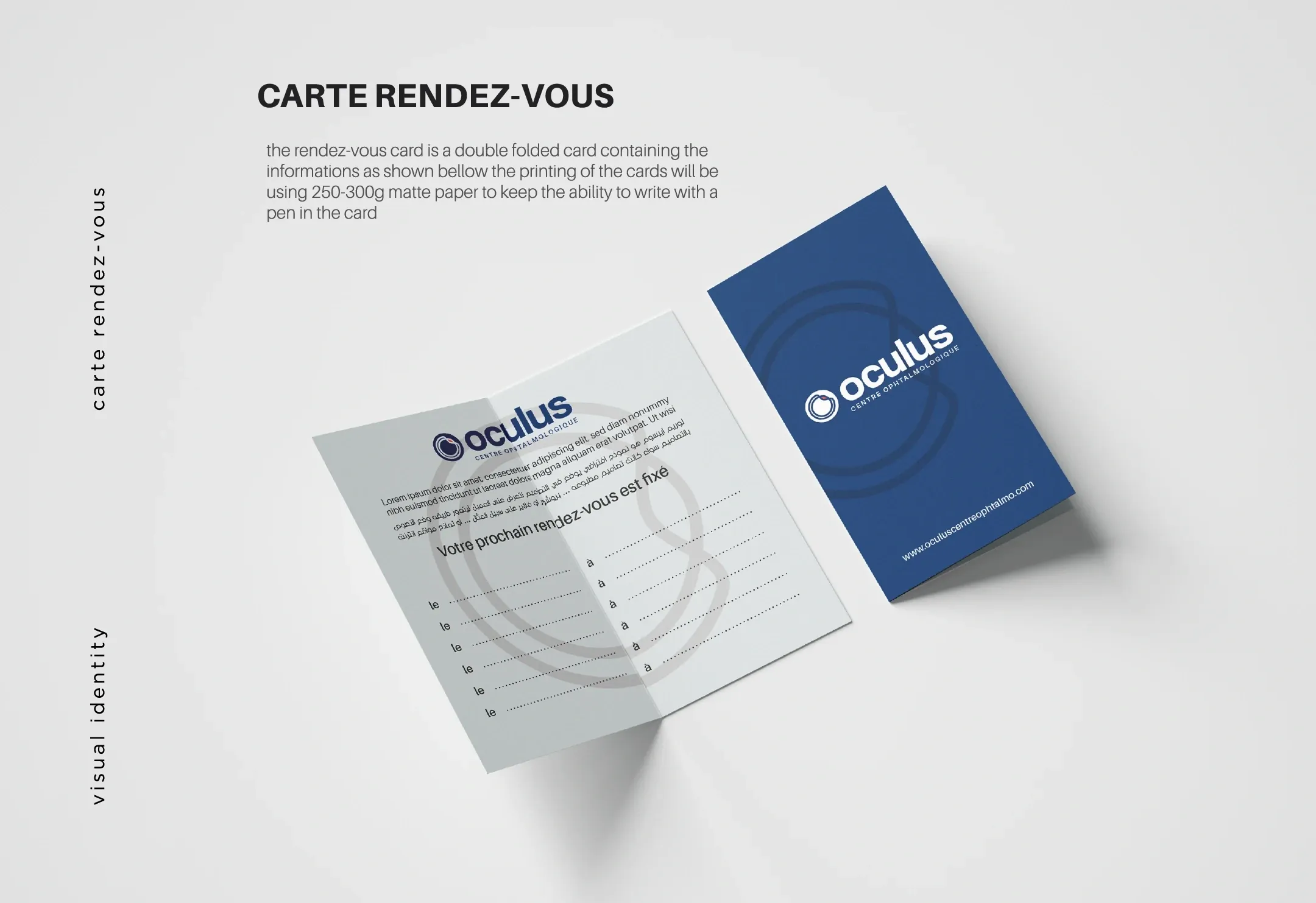
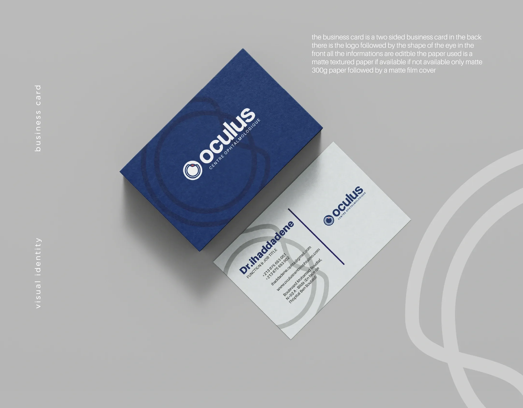
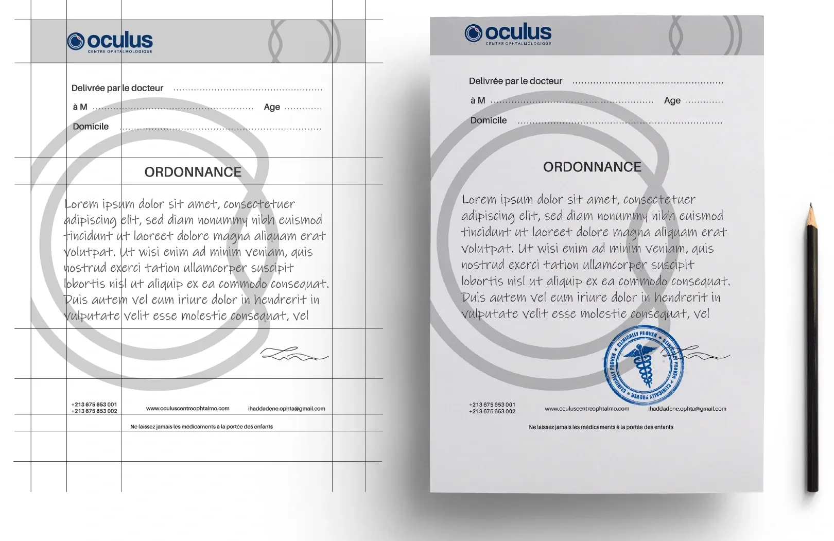
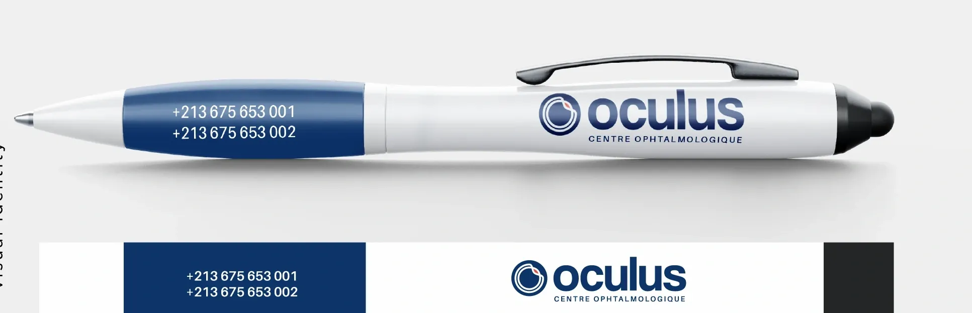
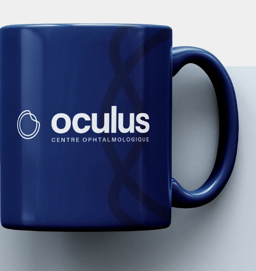
The eye’s curves become a graphic element across stationery. Scaled up, cropped, or set quietly behind information, they connect the business cards, appointment cards, folders, and prescription layouts. Blue establishes recognition; generous light areas keep practical information readable.
04 / ENVIRONMENT & DIGITAL
Beyond the printed page.
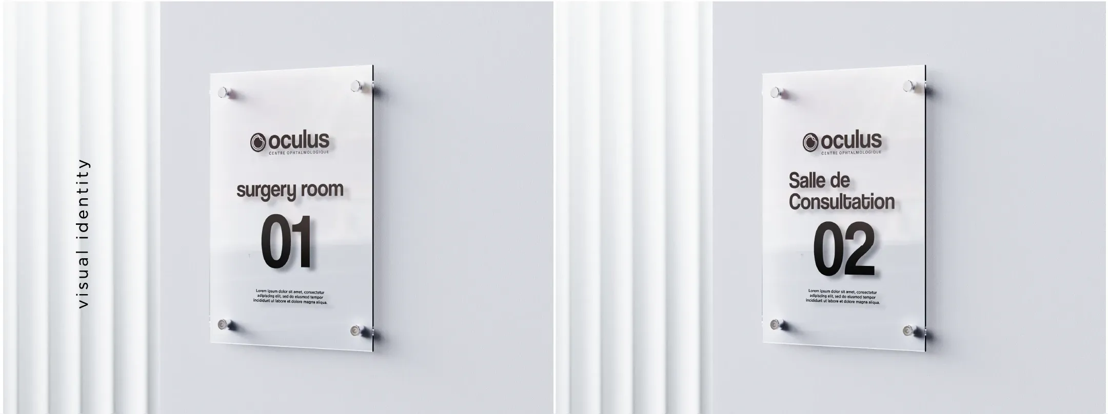
The identity also moves into the physical practice. Glass room plaques combine the mark with room information, carrying the same visual language into the spaces patients navigate.
THE DIGITAL EXPRESSION
Recognisable at every scale.
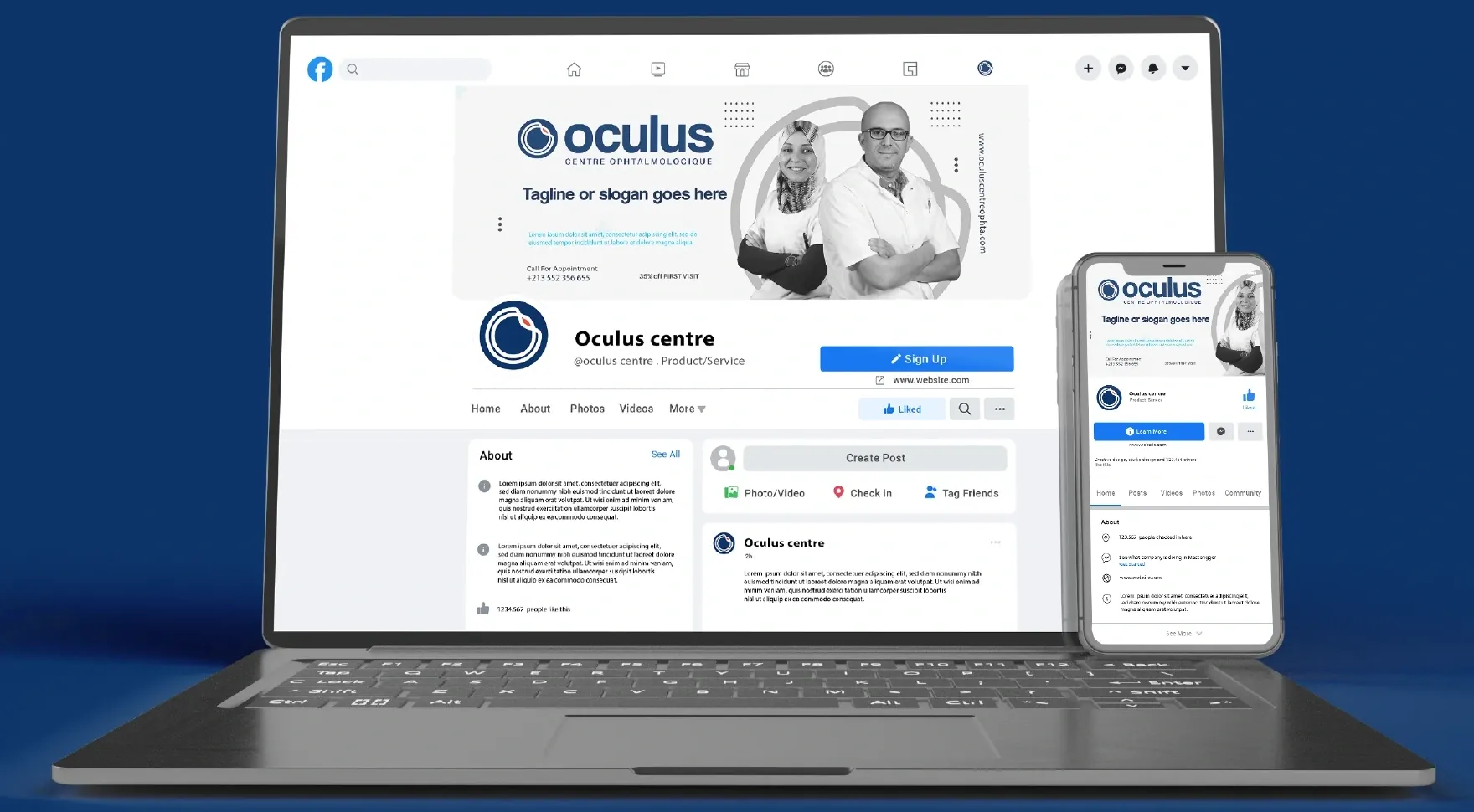
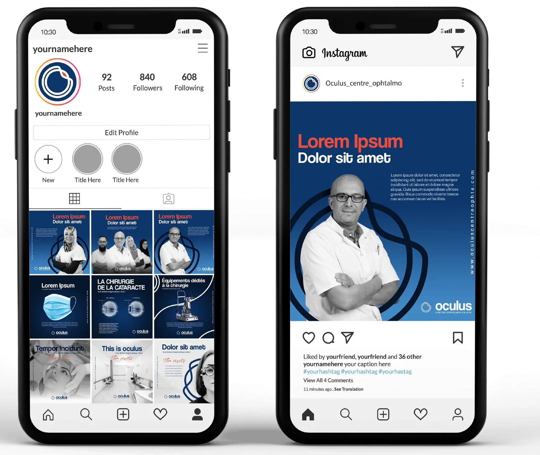
The social-media concepts extend the system through monochrome photography, blue fields, and clear typographic hierarchy. Profile images, banners, and post layouts stay connected to the printed identity while adapting to a smaller screen.
OCULUS / VISUAL IDENTITY
One idea. A consistent point of view.
A visual identity rooted in the eye, developed across the materials, spaces, and communications of an ophthalmology centre.
View the original project on Behance Fettah — El Florentino · Zone Agency